Jamie Schneider Digital Strategist for the North American Division.  We’ve all seen shortened URLs, but do you know why social media managers often shorten long links? Here is a quick “short list” of why and how to utilize link shorteners. What: URL shortening allows you to tighten up a long trackable URL to something short and easy to copy for social media posts. In other words… THIS: https://www.adventistlearningcommunity.com/faith-reason-earth-history?&utm_campaign=FaithReasonEarth-2017&utm_source=Social-Media BECOMES: https://goo.gl/ZaBXgL 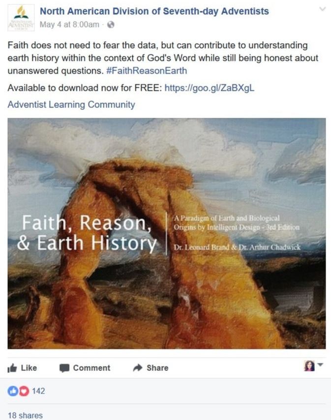 Why:
Many link shortening tools also track click-throughs (how many times the link has been clicked). Below you can see that this link is performing quite well. But for more in-depth analysis you’ll want to use UTM codes and Google Analytics. 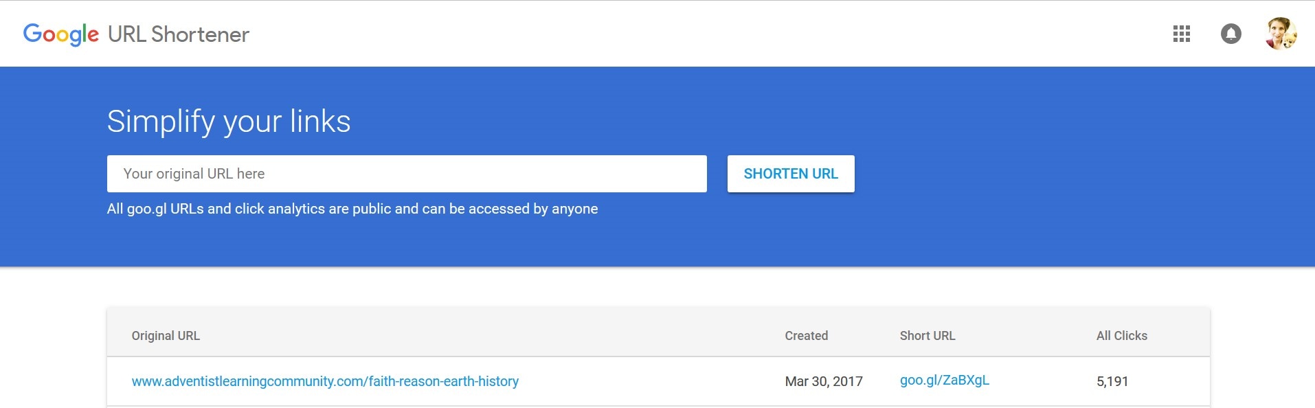 The Short List of URL Shorteners There’s more, but these are our current favorites.
You may also appreciate this free redirect checker. This is useful if you're curious about a shortened link and you don't trust the source. 
1 Comment
Jamie Schneider Digital Strategist for the North American Division.  Google Analytics is a free and essential tool for monitoring and understanding how visitors interact with your website and where they come from. This blog post will give you a quick tour and highlight some important terms and features. It is very easy to set up:
 When you open your Google Analytics account, you’ll see your Audience Overview report. In the top right, you can change the date range. In the center, you can see the data for the various terms above. On the left-hand side is the main navigation. 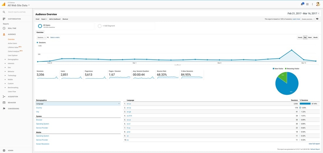 Avoid Data Paralysis: Time is valuable. Don’t get so caught in the details or data that you never move forward, or respond too late and miss an important opportunity. Prioritize based on your goals; you don’t have time to track everything!  Most non-profits do not have the luxury of a dedicated analytics team. But you don’t need to dive too deep to get valuable information about how your website and campaigns are performing. Here are the key metrics to monitor that won’t overwhelm you, but will maximize your data-driven decision making. Audience metrics:
Age & Gender Under demographics you can view known age & gender. In the below example, only 36.68% of total sessions have corresponding demographic data. Even though the data is incomplete, it does give a pretty good cross-section of who is visiting the website. 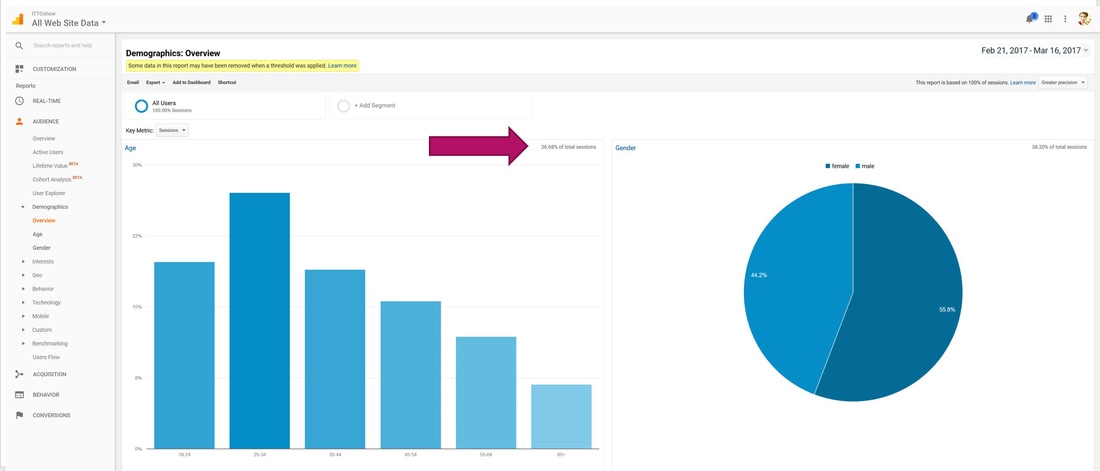 Location You can see location by country, city, state, and metro area. You can also look at language if that is relevant to your ministry. In addition, you can analyze the number of sessions and users as well as their behavior such as bounce-rate, pages per session or depth-of-session and average session length. 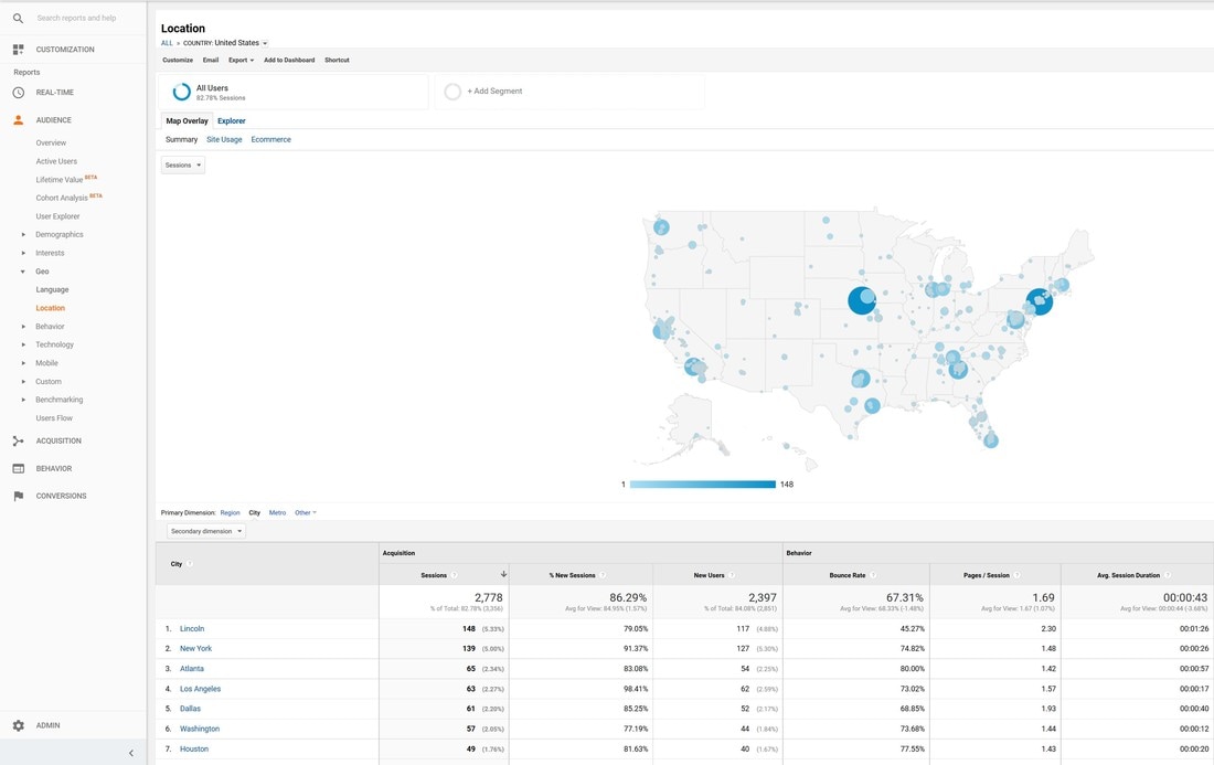 Engagement Length of visit/depth of visit. 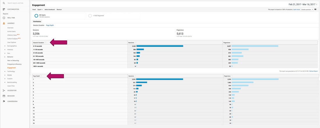 Behavior – Site Content Here you can determine your most popular and least popular pages. 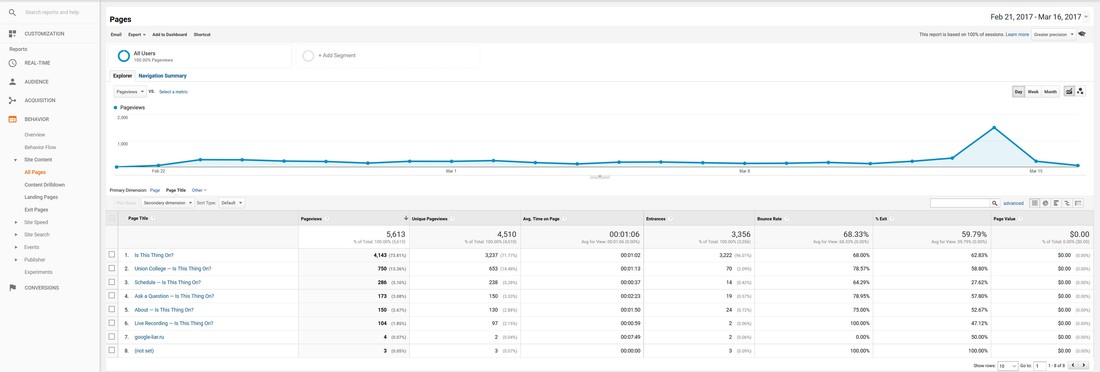 Acquisition - Traffic Sources As communicators, we want to know what is working and what is not working to drive people to our website. In Google Analytics, we can find important data on channels under Acquisition Overview. This is where UTM codes come in! In the below example for Is This Thing On, we can see that trackable links accounted for 90.9% of the traffic to the website, meaning that our campaign was a huge driving factor behind awareness and traffic. Keep in mind that OTHER represents links with tracking codes or campaigns. Click here to learn more about UTM codes. 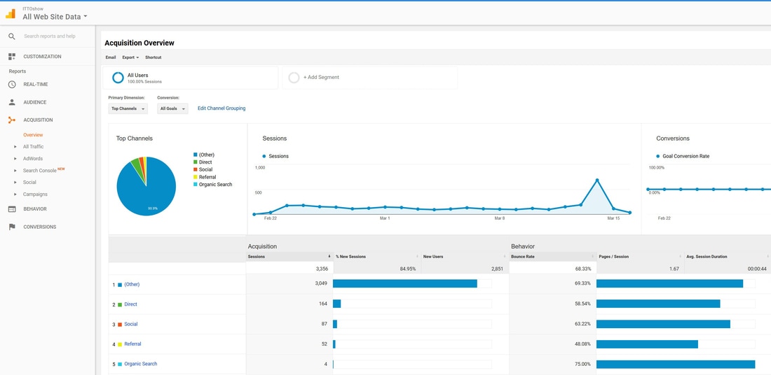 The channel breakdown is as follows:
When we drill down deeper under campaigns, we can learn what aspects of a campaign performed the best by using unique UTM campaign names for the different components of our communications strategy. Google Analytics automatically picks up the campaign name and source from the links. No need to do anything in Google Analytics to make this work! Just be consistent with the UTM codes you use and clear with your campaign and source names. In the below example, we can see that the biggest driving factor behind campaign traffic was the paid ads. Next was the Facebook event link. 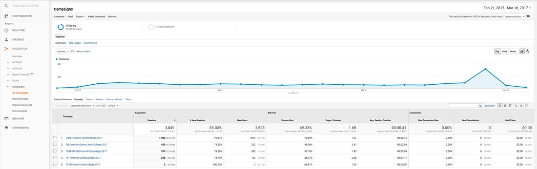 And that is our quick intro to Google Analytics! Remember to:
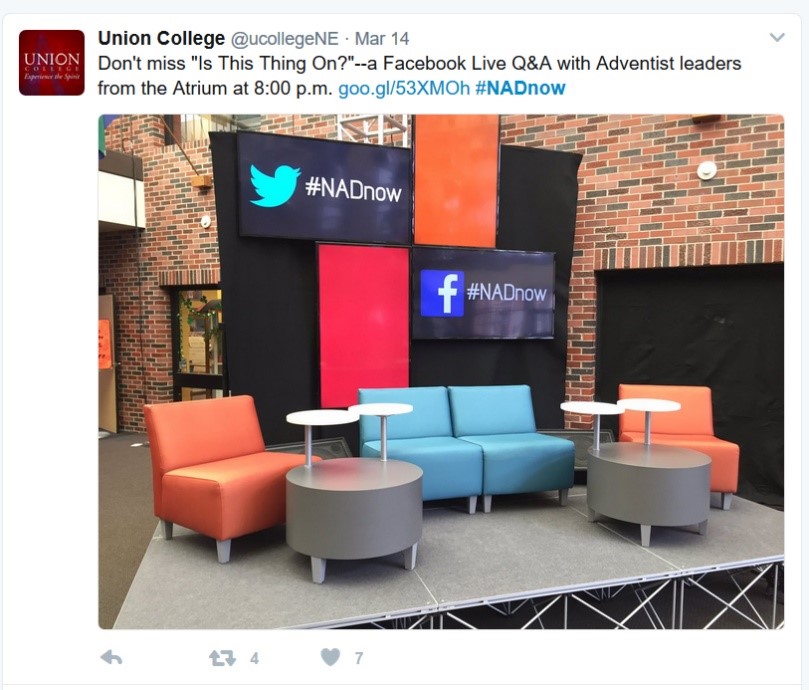
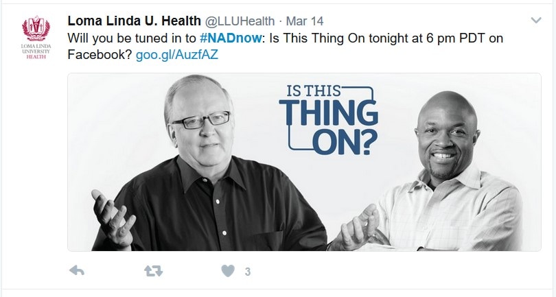
Ask your questions below or tweet using #DigitalEvangelism. Jamie Schneider Digital Strategist for the North American Division.  A Case Study in Equipping & Empowering Social Media Ambassadors Most of time, events don’t happen in a silo but rather involve several partners. I have found time and time again that active social media partnerships are a key element in successfully promoting events on social media. If you reach out to 10 contacts who each have a “small” social media following of 1,000 people, your message suddenly has the potential to reach up to 10,000 people online. Reach out to more contacts, with bigger fan bases, and you can see how your reach can grow exponentially.  Communicators typically have a lot on their plates, and social media manager is just one of many hats that they wear throughout the work week. Contacts are often willing to promote partner events through their various digital channels, but time and resources are limited. With this reality in mind, providing your partners with a “promotions packet” is an effective and easy way to equip your contacts with the resources they need to easily become social media ambassadors and share your message. Normally, when marketers reach out to contacts and ask for promotion on their behalf, there is an assumption that the partner is responsible for writing the posts and generating the content. As a result, most requests are not prioritized and do not realize their full potential. A promotions packet, on the other hand, provides recommendations, pre-made social media posts, eNewsletter blurbs, tracking links, graphics, and more. Then the social media manager only needs to copy, paste, and schedule. They can of course modify the message for their audience if desired or necessary, but they no longer have the burden of generating everything on their own. This approach also has the added benefit of allowing you to control the quality and consistency of your brand’s message as it is distributed through your partner’s channels. Our recent campaign for the pilot episode of “Is This Thing On?” is a prime example of how a promotions packet can be utilized to magnify reach online to targeted audiences. Is This Thing On? is a new series that aims to connect Adventist young people with church leadership to discuss relevant topics via a live interactive social media experience. With just three weeks to promote the first episode held at Union College, we utilized digital communications and partners to help us reach our targeted audience (Adventist young people). Along with a traditional press release that was sent to all the schools, conferences, unions, Adventist media, and partners, we included a promotions packet of pre-made social media posts with our branded hashtag #NADnow.
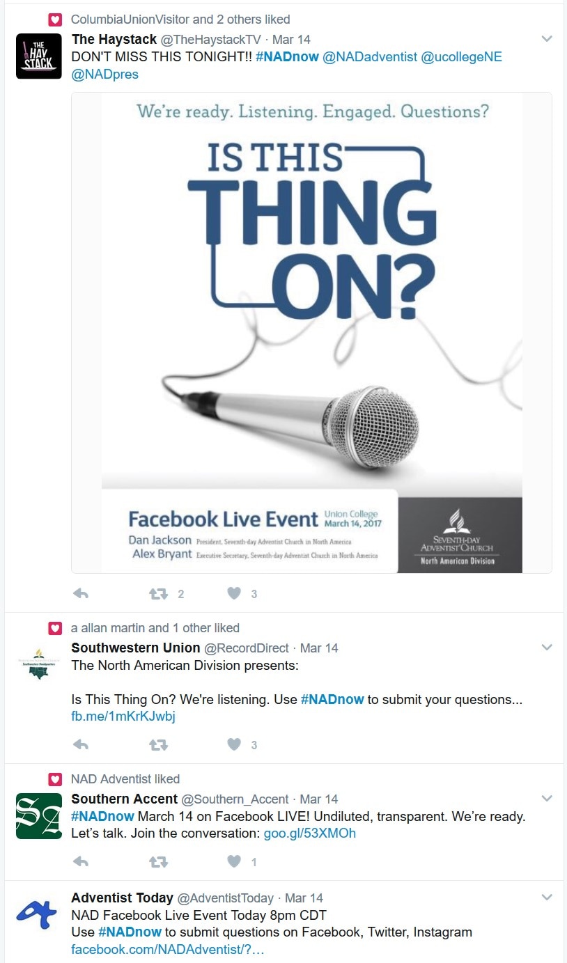
Because we provided a promotions packet as a resource, our contacts felt empowered to promote the event to their followers, and awareness for the event quickly spread, helping us reach more of our target audience. Below are select examples of contacts who made use of this promotions packet. As you can see, some posted the provided posts; others modified the messages to suit their audience. Either way, these partnerships generated increased awareness of the event. If we add up the followers of these seven examples (we had many more than seven social media ambassadors across Twitter, Facebook, Instagram, and email), there is a combined potential reach of over 16,700 followers on Twitter, which is more than the current total Twitter account followers of @NADadventist alone (15,800).
  The #NADnow hashtag gives us the ability to find related posts, and we can also track traffic to the website through Google Analytics tracking codes. The goo.gl link provided in the promotions packet social media posts allowed us to record the number of visitors to the website and discover where they heard about “Is This Thing On?”. Full link: https://www.ittoshow.com/?&utm_campaign=PP-NADnow-UnionCollege-2017&utm_source=Social-Media To create your own trackable link, simply add ‘?&utm_campaign=PP-NAME-of-Campaign-Date&utm_source=Social-Media’ to the end of your destination url and update the the campaign name and source to reflect your event by simply editing the text (no fancy software or applications needed). I used ‘PP’ in the campaign name to indicate that the link is from the promotions packet. Then shorten the link. To learn more: URL Shorteners: How & Why to Shorten Your Links. To view the data: go into your Google Analytics account for your website, choose “Acquisition” from the left-hand menu, expand campaigns, then choose “All Campaigns.” You should be able to see your various campaign names and sort by source if desired. If you do not have your website connected to Google Analytics, I highly recommend that you do. It’s free, and it can help you make strategic decisions. Learn how>> For the #NADnow campaign, the promotions packet resulted in 265 visits to the website, in addition to the already expanded reach across multiple social media platforms. 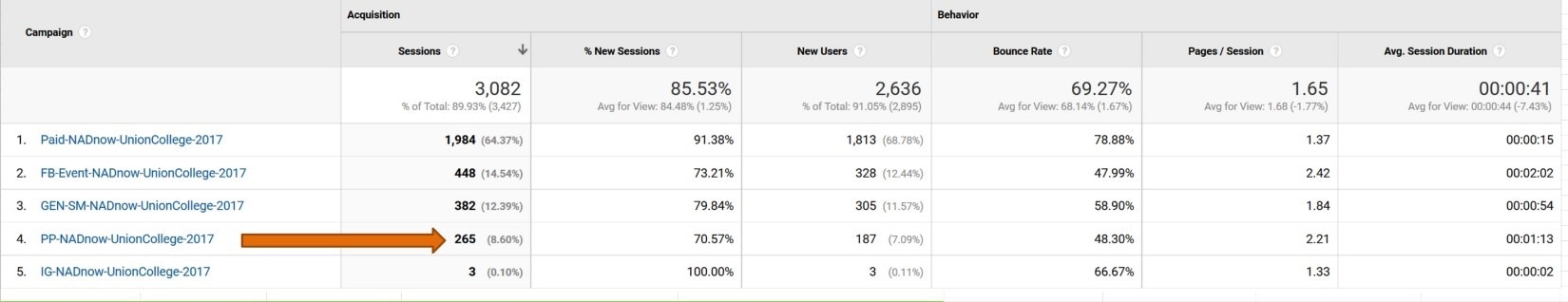 Now this is just one aspect of a multi-channel, multi-platform campaign that works together for one unified goal. I strongly encourage you to create your own promotions packets and develop digital partnerships to help expand your reach in future campaigns. Plus, in a world of limited budgets, it only costs you time and effort. Download the #NADnow promotions packet to use a template for you own campaigns. One last important note: make sure that when you reach out for help with promoting your events, you are not only willing to reciprocate, but able to follow through with such agreements. Partnerships should be mutually beneficial, and trust can be built and cultivated over time when both parties follow through on their promises. Post your questions or comments below. We love hearing from you! Jamie Schneider Digital Strategist for the North American Division. Jeremiah 17:9 tells us, “The heart is deceitful above all things…” While the context is different, we must remember this principle before allowing our feelings and impressions to determine our marketing strategies. In my ten years’ experience, I have noticed that event coordinators (honestly, all of us) tend to remember the past either more favorably or less favorably than it really was. This inclination can often result in unnecessary panic or misguided changes in the promotions strategy. However, if you host a similar program on a regular basis, there is an easy way to gain insight into patterns in your audience’s registration tendencies and eventually be able to accurately predict registration based on data, not feelings. In turn, this allows you to make informed strategic decisions to meet your goals. I’m simply talking about creating a “Registration Trends” chart like this example from the Society of Adventist Communicators Convention (Oct. 13-15, 2016) below. Please note: Y.O.Y. stands for year over year 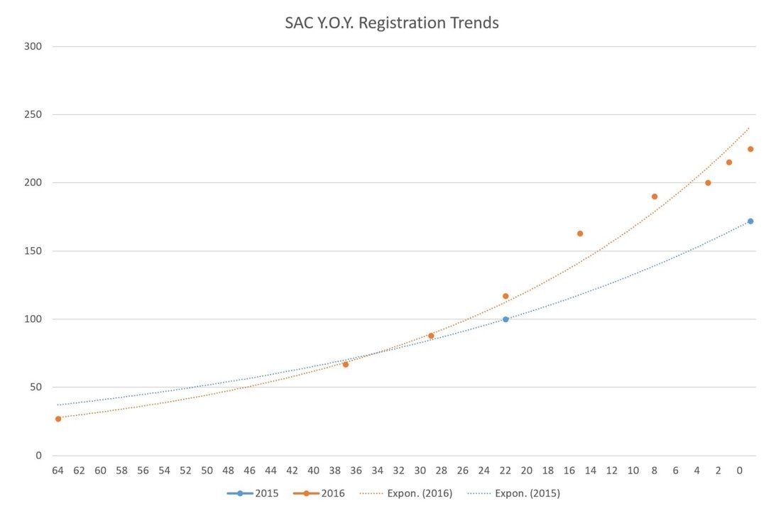 Days Until Event Certain types of registration software can create these types of graphs automatically, but if you don’t have access to that software, you can easily create one manually like the graph above. The valuable insights that you’ll gain will certainly be worth the time and effort. Once you have the framework in place, you can add to the chart with data from the next event to reveal a series of trends lines to help you see patterns in registration. In this case, we were able to see that this audience tends to register late and at 22 days out from (before) the event, we were tracking ahead of the previous year even though we “felt” behind in registration numbers. We also observed an 18% increase in registration during the last week (10/5-10/13) of the campaign, which is valuable information for predicting final registration numbers and expounding on other event needs, like catering and lodging. To manually create a registration trends graph, begin by tracking registration numbers by date starting 90 to 60 days out from the event. Set a weekly reminder to take note of the registration numbers. For the above example, we were able to find the registration number 22 days out for the previous year (2015) and the final number for comparison. For 2016, we recorded the registration numbers 64 days out, and then weekly starting 37 days out. Finally, we recorded the numbers every few days throughout the final week of the campaign. The results were recorded in the simple table below. Next we created a chart in PowerPoint, using the ‘Line with Markers’ option. 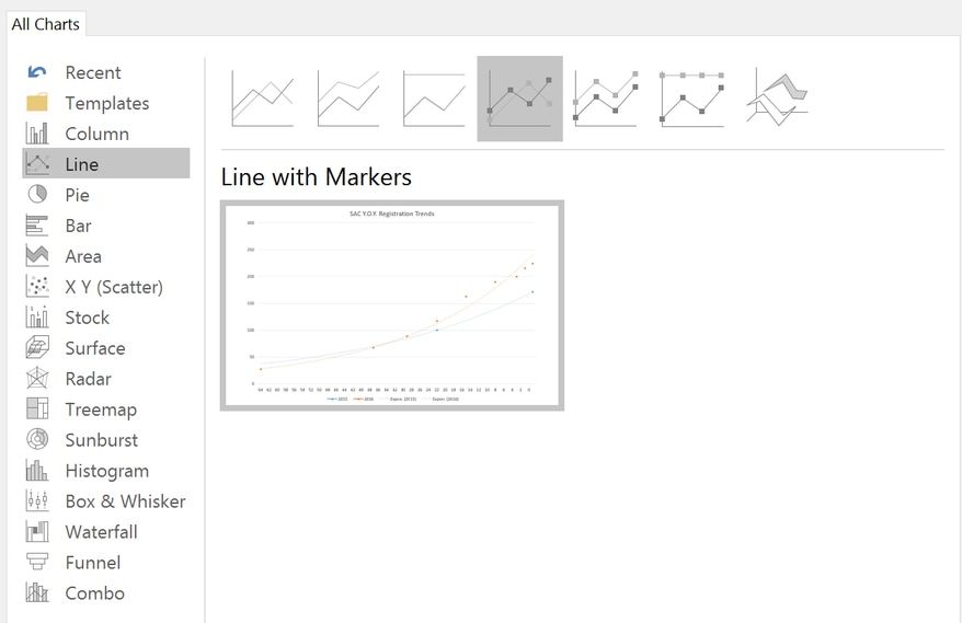 Then I matched the dates with the number of days prior to the event and graphed it into the chart. I also plugged in the two known 2015 numbers. 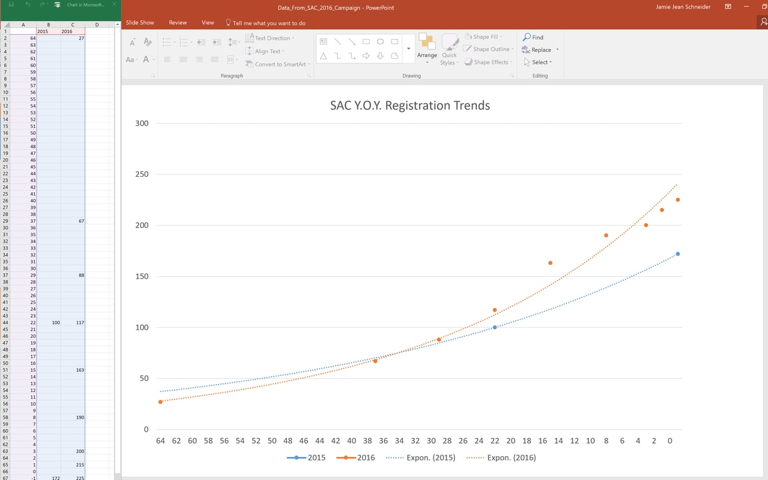 Finally, I chose chart style 12 which shows the actual counts plotted along with an exponential line. Now that the framework is in place, I can begin plotting the 2017 numbers as soon as the registration for the next conference begins. This chart will enable us to better identify registration problems and anticipate total numbers, helping us make informed decisions based on data, not “hunches.” That concludes this #DigitalEvangelism quick tip! You don’t need fancy software to create useful tools for you and your team. Feel free to comment or ask questions below. Click here to download a registration trends template for your event campaign use. |
Archives
August 2020
Categories
All
|
||||||
- Home
- BLOG
-
RESOURCES
-
RESOURCE MENU
>
- ADVENTIST IDENTITY GUIDELINES
- BIG DATA RESOURCES
- BRANDING, IMAGE & DESIGN RESOURCES
- CHURCH/MINISTRY SPECIFIC RESOURCES
- COPYRIGHT & TRADEMARK BASICS
- COURSES
- EMAIL RESOURCES
- GUIDANCE FOR HIRING SOCIAL MEDIA POSITIONS
- PODCASTS
- REPORTS & CASE STUDIES
- SOCIAL MEDIA RESOURCES
- (SOCIAL) VIDEO RESOURCES >
- TEXTING 4 CHURCHES
- TRACKING & ANALTYICS
- WATCH VIDEOS & TUTORIALS
- WEBSITE TIPS
- SOCIAL MEDIA GUIDELINES
-
RESOURCE MENU
>
- SEO
- Digital Discipleship & Evangelism
- COVID-19 RESOURCES
- eNEWSLETTER
 RSS Feed