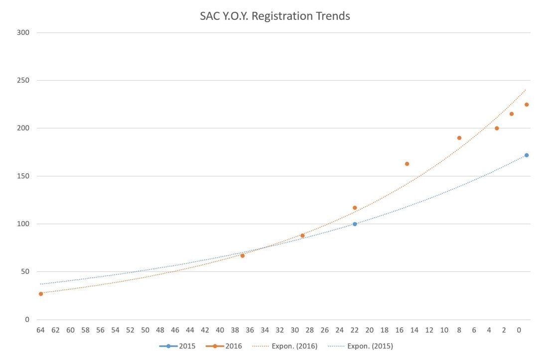
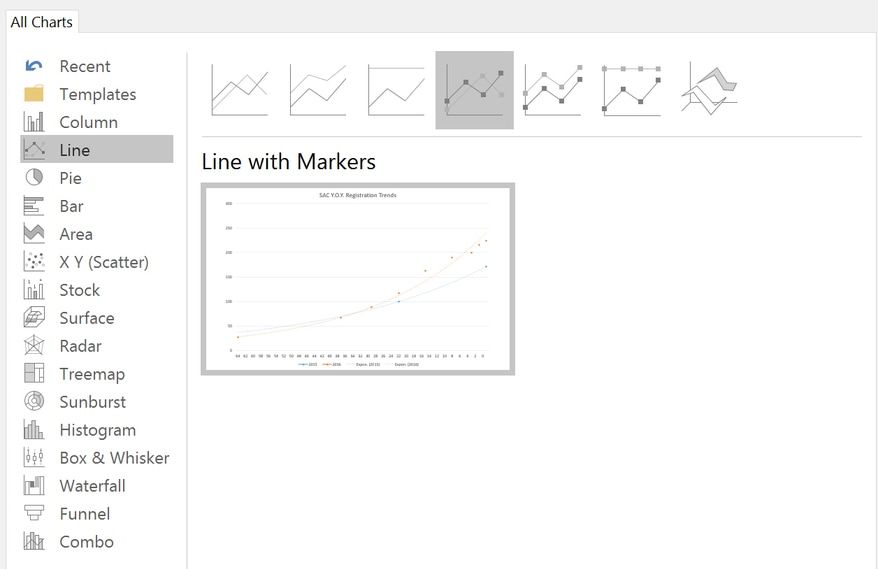
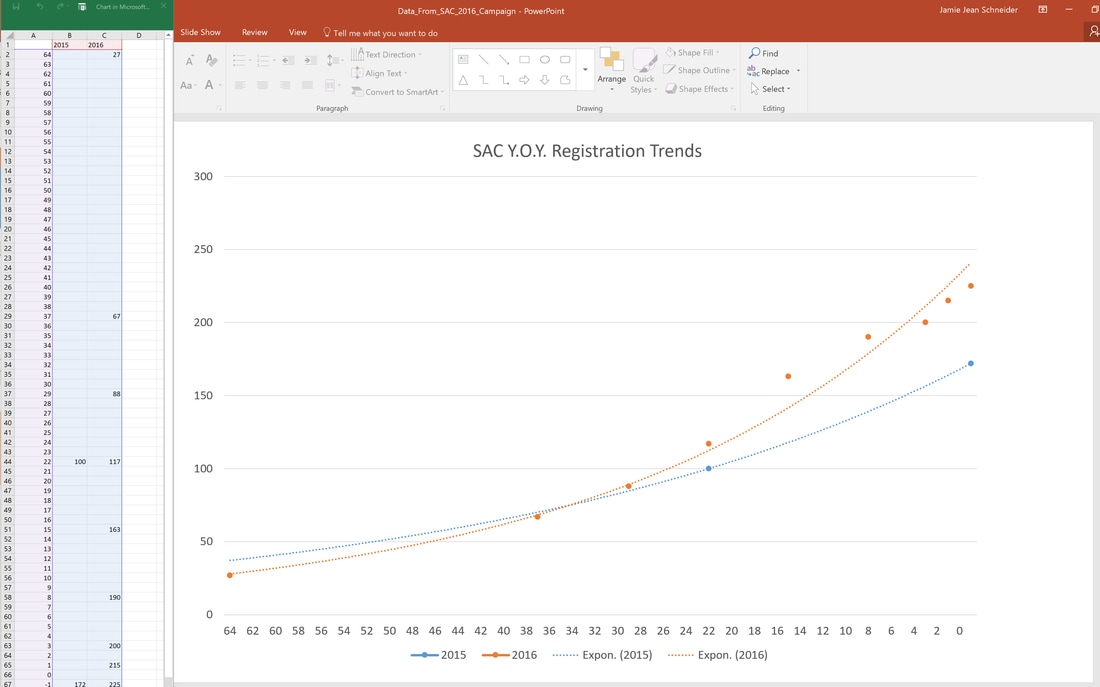
Jamie Schneider Digital Strategist for the North American Division. Jeremiah 17:9 tells us, “The heart is deceitful above all things…” While the context is different, we must remember this principle before allowing our feelings and impressions to determine our marketing strategies. In my ten years’ experience, I have noticed that event coordinators (honestly, all of us) tend to remember the past either more favorably or less favorably than it really was. This inclination can often result in unnecessary panic or misguided changes in the promotions strategy. However, if you host a similar program on a regular basis, there is an easy way to gain insight into patterns in your audience’s registration tendencies and eventually be able to accurately predict registration based on data, not feelings. In turn, this allows you to make informed strategic decisions to meet your goals. I’m simply talking about creating a “Registration Trends” chart like this example from the Society of Adventist Communicators Convention (Oct. 13-15, 2016) below. Please note: Y.O.Y. stands for year over year Days Until Event Certain types of registration software can create these types of graphs automatically, but if you don’t have access to that software, you can easily create one manually like the graph above. The valuable insights that you’ll gain will certainly be worth the time and effort. Once you have the framework in place, you can add to the chart with data from the next event to reveal a series of trends lines to help you see patterns in registration. In this case, we were able to see that this audience tends to register late and at 22 days out from (before) the event, we were tracking ahead of the previous year even though we “felt” behind in registration numbers. We also observed an 18% increase in registration during the last week (10/5-10/13) of the campaign, which is valuable information for predicting final registration numbers and expounding on other event needs, like catering and lodging. To manually create a registration trends graph, begin by tracking registration numbers by date starting 90 to 60 days out from the event. Set a weekly reminder to take note of the registration numbers. For the above example, we were able to find the registration number 22 days out for the previous year (2015) and the final number for comparison. For 2016, we recorded the registration numbers 64 days out, and then weekly starting 37 days out. Finally, we recorded the numbers every few days throughout the final week of the campaign. The results were recorded in the simple table below. Next we created a chart in PowerPoint, using the ‘Line with Markers’ option. Then I matched the dates with the number of days prior to the event and graphed it into the chart. I also plugged in the two known 2015 numbers. Finally, I chose chart style 12 which shows the actual counts plotted along with an exponential line. Now that the framework is in place, I can begin plotting the 2017 numbers as soon as the registration for the next conference begins. This chart will enable us to better identify registration problems and anticipate total numbers, helping us make informed decisions based on data, not “hunches.” That concludes this #DigitalEvangelism quick tip! You don’t need fancy software to create useful tools for you and your team. Feel free to comment or ask questions below. Click here to download a registration trends template for your event campaign use. Comments are closed.
|
Archives
August 2020
Categories
All
|
- Home
- BLOG
-
RESOURCES
-
RESOURCE MENU
>
- ADVENTIST IDENTITY GUIDELINES
- BIG DATA RESOURCES
- BRANDING, IMAGE & DESIGN RESOURCES
- CHURCH/MINISTRY SPECIFIC RESOURCES
- COPYRIGHT & TRADEMARK BASICS
- COURSES
- EMAIL RESOURCES
- GUIDANCE FOR HIRING SOCIAL MEDIA POSITIONS
- PODCASTS
- REPORTS & CASE STUDIES
- SOCIAL MEDIA RESOURCES
- (SOCIAL) VIDEO RESOURCES >
- TEXTING 4 CHURCHES
- TRACKING & ANALTYICS
- WATCH VIDEOS & TUTORIALS
- WEBSITE TIPS
- SOCIAL MEDIA GUIDELINES
-
RESOURCE MENU
>
- SEO
- Digital Discipleship & Evangelism
- COVID-19 RESOURCES
- eNEWSLETTER


 RSS Feed