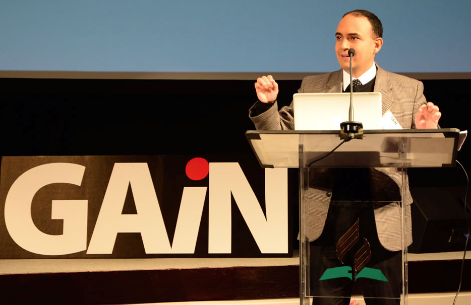
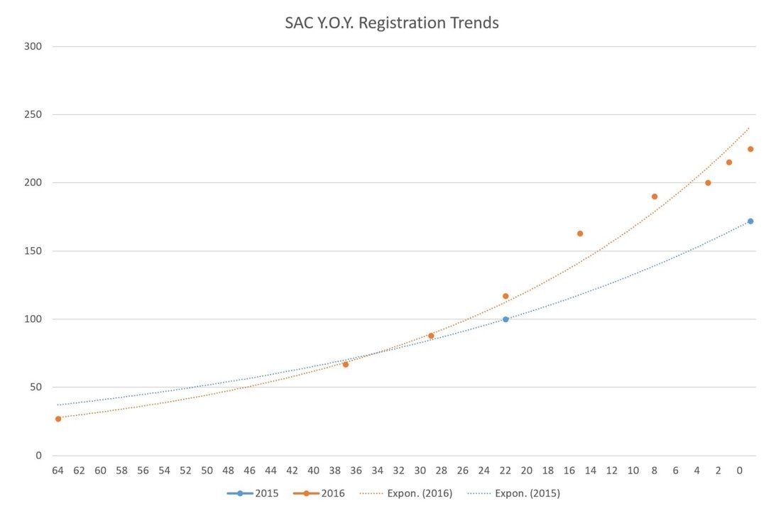
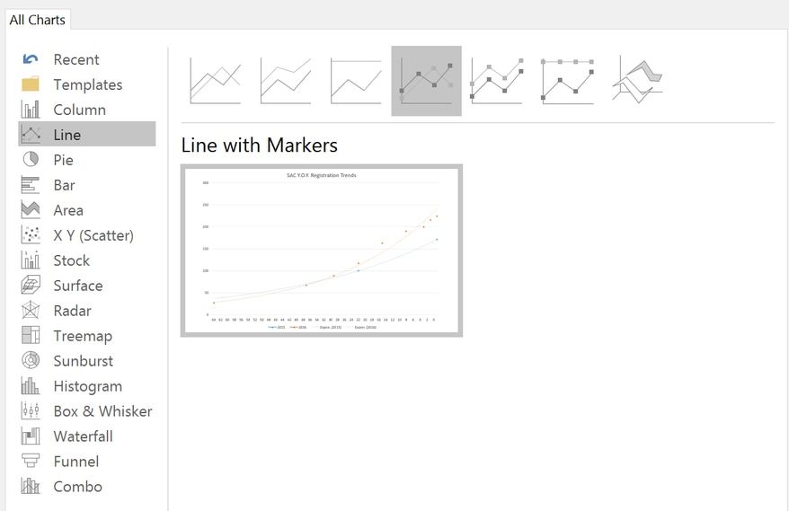
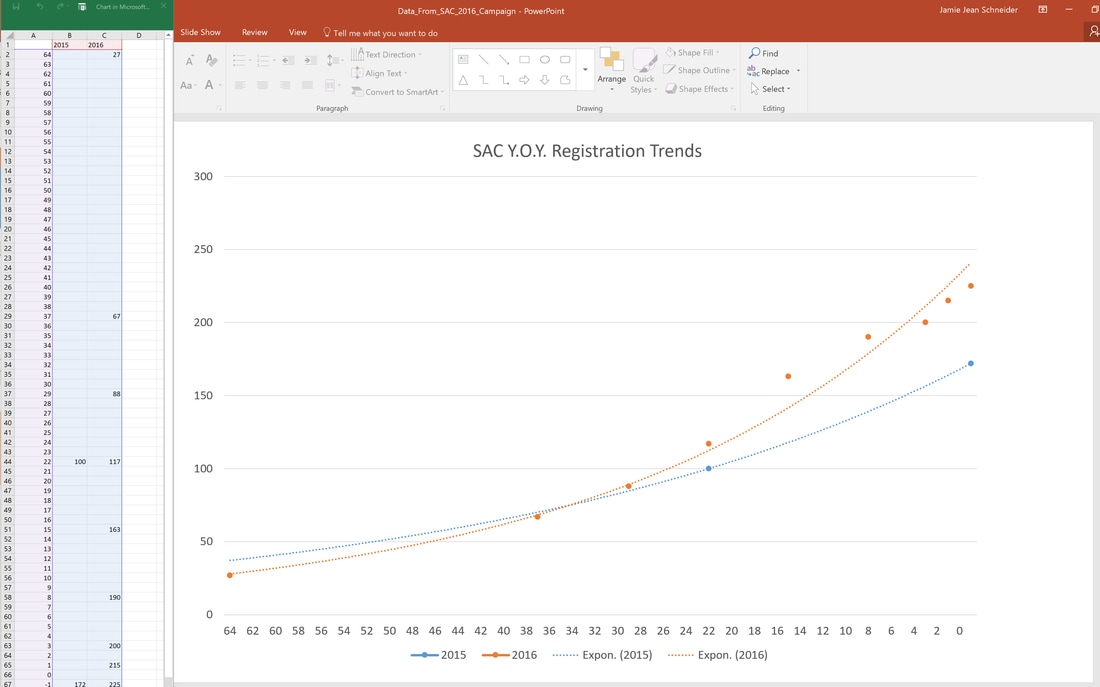
Harvey Alférez, Ph.D Data Scientist, School of Engineering and Technology, Montemorelos University, Mexico Following Christ’s method to reach the city dwellers of our day means understanding and meeting their needs. This presentation describes the potential of data science, which is the study of the generalizable extraction of knowledge from data, to help us understand those needs in an unprecedented way. If we understand people's needs, then we’ll be more effective in reaching them. Watch presentation from GAiN 2016 Erica Jones Assistant Director for the North American Division's Women's Ministries Department Have you ever been told to “put your money where your mouth is”? The origin of this widely-known expression is unclear, but its intended meaning is not: when you value something, you put your resources behind it. For years, we have been watching as a growing number of teens and young adults leave the Adventist Church, and we ask, “’why?” I’ve searched for the answer to this question and have found that one reason surfaces more than any other: they don’t think the church is relevant to them. The leadership of the North American Division not only recognizes this problem, but has also committed to actively investing in new avenues to reach our young people with a message of hope and wholeness. When asked to serve as the assistant director for Women’s Ministries, I understood my primary role would be to create resources for teen girls and young adult women. As I travel and meet some of the amazing young women in our division, I feel certain God is leading and opening hearts. As they’ve shared their personal struggles and questions of faith with me, however, I am convinced that unless we minister to our young people in a way that speaks to their everyday lives—and is relative to the real issues (and distractions) they are facing—and in a communication method they respond to—we will continue to see an exodus of this next generation. Today’s youth are bombarded with thousands of messages every day. They spend an average of nine hours a day on social media.[1] The Church cannot ignore this reality; not only must we have a voice on social media platforms, our voice must be clearer and more relevant than all of the others they are hearing. When the media tells our girls they’re not thin enough or running with the right group of people, we must speak up and help them understand how beautiful they are in God’s eyes. When they struggle to see their own self-worth, we must speak up and remind them that they are daughters of the King. Together with the NAD Education and Youth departments, Women’s Ministries has developed an online blog to facilitate conversation about real-life issues and to give our young women a place to ask tough questions anonymously. The Gorgeous2God blog serves to inspire and uplift teen girls while providing a Christian perspective on how to navigate the unique challenges they face. We are often hesitant to open the door for difficult questions because we fear we may not have the answer. But I have found that young adults care less about us having the answers and more about feeling they have spiritual support and the ability to grow in a non-judgmental environment. They are looking for leaders who are consistent, committed, and compassionate. They wilt under criticism, but grow spiritually when they are mentored by a loving, mature Christian family. If being a Seventh-day Adventist looks like nothing more than a list of “don’ts,” they’re not interested. They’re searching for a faith that is deeper than how they dress or what they eat—a faith that is relevant, engaging, and serves others in practical ways. As leaders, parents, and mentors, we have a critical role to play in encouraging them as they search, and showing compassion and understanding when they stumble. Every young person needs a feeling of acceptance, belonging, and validation; this must be reinforced by offering opportunities for leadership. Our goal must be to convince them that they have a stake in the future of the Church. I am grateful to be a part of the North American Division family and to have been given an opportunity to serve the Church in a leadership capacity. I thank the leaders of this division for being willing not only to speak up, but to put resources behind what they value: our young people, the future of the Church. Check out Gorgeous2God through these online platforms: Gorgeous2God.org Facebook @Gorgeous2God Pinterest @Gorgeous2God Instagram @Gorgeous2God Jamie Schneider Digital Strategist for the North American Division. Jeremiah 17:9 tells us, “The heart is deceitful above all things…” While the context is different, we must remember this principle before allowing our feelings and impressions to determine our marketing strategies. In my ten years’ experience, I have noticed that event coordinators (honestly, all of us) tend to remember the past either more favorably or less favorably than it really was. This inclination can often result in unnecessary panic or misguided changes in the promotions strategy. However, if you host a similar program on a regular basis, there is an easy way to gain insight into patterns in your audience’s registration tendencies and eventually be able to accurately predict registration based on data, not feelings. In turn, this allows you to make informed strategic decisions to meet your goals. I’m simply talking about creating a “Registration Trends” chart like this example from the Society of Adventist Communicators Convention (Oct. 13-15, 2016) below. Please note: Y.O.Y. stands for year over year Days Until Event Certain types of registration software can create these types of graphs automatically, but if you don’t have access to that software, you can easily create one manually like the graph above. The valuable insights that you’ll gain will certainly be worth the time and effort. Once you have the framework in place, you can add to the chart with data from the next event to reveal a series of trends lines to help you see patterns in registration. In this case, we were able to see that this audience tends to register late and at 22 days out from (before) the event, we were tracking ahead of the previous year even though we “felt” behind in registration numbers. We also observed an 18% increase in registration during the last week (10/5-10/13) of the campaign, which is valuable information for predicting final registration numbers and expounding on other event needs, like catering and lodging. To manually create a registration trends graph, begin by tracking registration numbers by date starting 90 to 60 days out from the event. Set a weekly reminder to take note of the registration numbers. For the above example, we were able to find the registration number 22 days out for the previous year (2015) and the final number for comparison. For 2016, we recorded the registration numbers 64 days out, and then weekly starting 37 days out. Finally, we recorded the numbers every few days throughout the final week of the campaign. The results were recorded in the simple table below. Next we created a chart in PowerPoint, using the ‘Line with Markers’ option. Then I matched the dates with the number of days prior to the event and graphed it into the chart. I also plugged in the two known 2015 numbers. Finally, I chose chart style 12 which shows the actual counts plotted along with an exponential line. Now that the framework is in place, I can begin plotting the 2017 numbers as soon as the registration for the next conference begins. This chart will enable us to better identify registration problems and anticipate total numbers, helping us make informed decisions based on data, not “hunches.” That concludes this #DigitalEvangelism quick tip! You don’t need fancy software to create useful tools for you and your team. Feel free to comment or ask questions below. Click here to download a registration trends template for your event campaign use. Rodney BradyTreasurer of the South Pacific Division We learned from the tithe-studies done in our region that many people don't really choose not to return tithe or give offerings. They just don't get around to it or don't have the money with them when they get to church. We realized that we needed to develop a website and a mobile giving app that addressed how people were managing their finances today.
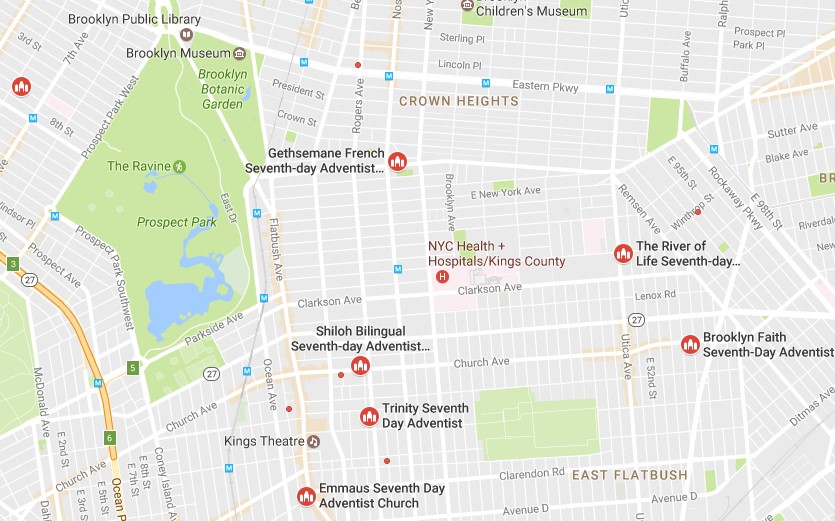
We've been rolling out the online and mobile options over the last three years. In the first year, we had about two million dollars in tithe coming in from that source, but now, we're reaching almost two million dollars per month! We think that a lot of that increase has to do with being able to access the e-giving website and app. When we looked at the reports, the internet site usage goes up on the days that most people get paid, and on the offering side, i.e. the mobile app, the usage spike occurs during the Sabbath worship service time. It has become part of their worship. Since younger people and even older ones don't go around carrying cash anymore, we definitely need to engage our younger generation in this way, otherwise it's going to prevent them from giving. Stewardship is about planning ahead! We are in consultation with a few other divisions in this regard. The app has more than recovered the cost of its development. We are grateful for the vision and dedication of our IT people, and our administrators' support of the project. Watch an interview with the author>> This article originally appeared in the October-December 2016 issue of Dynamic Steward. eGiving app on iTunes Harvey Alférez, Ph.D Data Scientist, School of Engineering and Technology, Montemorelos University, Mexico There is tons of open data on the Web. This data can be freely used by Seventh-day Adventists to try to figure out ways to help the inhabitants in the cities. This post describes how the students at my Pattern Recognition course at Montemorelos University and I have used open data and machine learning, which is a key component of data science, to discover interesting mission-oriented patterns for the church at NYC. In my courses, I mostly focus on analyzing open data from NYC because of two reasons: 1) NYC has pivotal significance in our church’s ongoing Mission to the Cities project; and 2) NYC provides a portal that makes the wealth of public data generated by various NYC agencies and other city organizations available for public use [1]. Although the number of traffic deaths in NYC has fallen [2], city officials and traffic-safety groups agree that more aggressive steps must be taken to reach Mayor Bill de Blasio’s goal of eliminating traffic deaths in the city [3]. With this problem in mind, we analyzed a dataset of motor vehicle collisions in NYC, which is freely provided by the Police Department [4]. The studied dataset was created in 2014 and subsequently updated in 2016. This dataset registers motor vehicle collisions in Bronx, Brooklyn, Manhattan, Queens, and Staten Island from 2014 to 2016. This is a large dataset with 932,904 registered incidents! Moreover, each registered incident has 30 variables. With traditional queries and spreadsheet analysis it is quite difficult (and sometimes impossible) to obtain timely answers to unseen patterns in large quantities of data, such as in our case study. In this kind of cases, machine learning, which “gives computers the ability to learn without being explicitly programmed” [5], can help us to grasp patterns we did not know that even exist. From the set of 30 variables, we chose a subset to carry out the experiments. First, we chose the variables Date and Time because we wanted to know the day and time of each traffic incident. The Zip Code, Borough, Longitude, and Latitude variables were chosen because we wanted to know the demographic information of the accidents. Also, we had interest in figuring out the demographic groups that were injured the most. Therefore, we included in the experiments the Injured Persons, Injured Pedestrians, Injured Motorists and Injured Cyclists variables. Last but not least, we wanted to determine what provoked the accident and the type of vehicle that caused the accident. Therefore, we chose the Contributing Vehicle 1 and the Vehicle Type Code 1 variables from the dataset. In order to analyze the data, we used Weka, which is a powerful tool for machine learning [6]. Although Weka contains a large range of machine learning algorithms, for our exploration we used the K-Means algorithm because the input data is unlabeled. Our findings are as follows:
I thank the students at my Pattern Recognition course, Anthony, Claudia, Carlos, Isaías, Jairo, Eduard, Marco, Jaziel and Carlos, for their intense work on the experiments. References: 1. The City of New York, “NYC Open Data,” (n.d.), https://data.cityofnewyork.us. 2. E. G. Fitzsimmons, “Number of Traffic Deaths in New York Falls for a Second Straight Year,” (2016), http://www.nytimes.com/2016/01/02/nyregion/number-of-traffic-deaths-in-new-york-falls-for-a-second-year-in-a-row.html. 3. M. Flegenheimer, “De Blasio Outlines Steps to Eliminate Traffic Deaths,” (2014), https://www.nytimes.com/2014/02/19/nyregion/de-blasio-unveils-plans-to-eliminate-traffic-deaths.html. 4. NYPD, “NYPD Motor Vehicle Collisions,” (2014), https://data.cityofnewyork.us/Public-Safety/NYPD-Motor-Vehicle-Collisions/h9gi-nx95. 5. P. Simon, Too Big to Ignore: The Business Case for Big Data (Hoboken, NJ.: Wiley, 2013). 6. The University of Waikato, “Weka 3: Data Mining Software in Java,” (n.d.), http://www.cs.waikato.ac.nz/ml/weka/. |
Archives
August 2020
Categories
All
|
- Home
- BLOG
-
RESOURCES
-
RESOURCE MENU
>
- ADVENTIST IDENTITY GUIDELINES
- BIG DATA RESOURCES
- BRANDING, IMAGE & DESIGN RESOURCES
- CHURCH/MINISTRY SPECIFIC RESOURCES
- COPYRIGHT & TRADEMARK BASICS
- COURSES
- EMAIL RESOURCES
- GUIDANCE FOR HIRING SOCIAL MEDIA POSITIONS
- PODCASTS
- REPORTS & CASE STUDIES
- SOCIAL MEDIA RESOURCES
- (SOCIAL) VIDEO RESOURCES >
- TEXTING 4 CHURCHES
- TRACKING & ANALTYICS
- WATCH VIDEOS & TUTORIALS
- WEBSITE TIPS
- SOCIAL MEDIA GUIDELINES
-
RESOURCE MENU
>
- SEO
- Digital Discipleship & Evangelism
- COVID-19 RESOURCES
- eNEWSLETTER





 RSS Feed