Jamie Jean Schneider DommDigital Strategist, Social Media + Big Data, North American Division  While understanding your audience and developing a content strategy takes a lot of effort, constructing your social media posts is actually pretty straightforward and mostly formulaic. Once you have your content planned out and your target audience determined, there are basic principles to follow to maximize effectiveness across any channel. Even as the technology changes, these principles will largely stay the same. In this section we’ll cover how to create posts and write messages for social media that effectively communicate with and engage your target audience. Main principles for creating a post (also applies to paid ads):
Guidelines for choosing good visuals (also applies to paid ads):
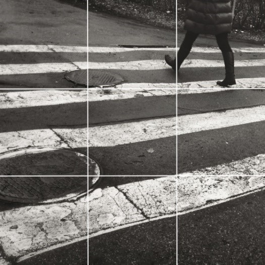
There are a lot of FREE or low-cost web-based tools out there like Canva with pre-made templates for social media images. If you’re short on high quality images, there are also stock photo resources available online where you can get professional images for free or very low cost. When laying out your images and designs, utilize the “Rule of Thirds.” This guideline divides an image into nine equal parts. Important elements of the image are placed along (or near) intersecting lines. This helps create tension, energy, and increases interest. 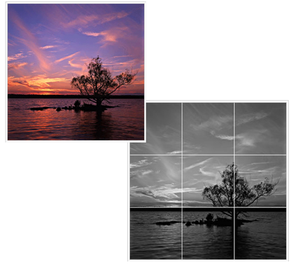 Visit SDAdata.org/branding-image-design-resources for guidance on free and low-cost stock images, design tips, and branding guides. General Tips for Getting Your Social Media Posts Noticed
Example: Feeling defeated? Marriage is hard and you're struggling. We're here for you. Join us for a free seminar. Click here to register in advance and get a free book with 5 practical tips for improving your marriage. Guidelines for Choosing HashtagsA hashtag is simply a way for people to search for posts on social media that have a common topic and to join or being a conversation. You may recognize it as the pound sign, or if you're a musician, a sharp sign. Hashtags can be used in many platforms such as Facebook, Twitter, and Instagram. When searching for hashtags on a particular platform, like Twitter, your results will only be pulled from Twitter. To see posts with the same hashtag on other platforms, you must search them separately. Instagram posts with the highest number of engagements have 11 or more hashtags attached. The ability to create a collective conversation has made hashtags a vital tool for reaching and engaging audiences that share a particular interest. For maximum impact and reach, use a combination of three types of hashtags:
TIP: Hashtags aren’t used much on Facebook. The platform’s current search capability (as of 2020) isn’t polished and, often, relevant posts don’t show up when searched. It doesn’t necessarily hurt to add a couple hashtags on Facebook to help people understand what you’re talking about or reinforce branding. In general, take advantage of hashtags on Instagram and Twitter. Download the Hashtag library to help with your hashtag strategy. Anatomy of a Strong Social Media PostUse the following format to write a practice post for your ministry and brainstorm visuals. Follow this format for each platform the message will be posted to. Message (Copy):
Visual/media: Use the following space to determine if your visual is well suited to your message and goals. (Applicable to either pictures or video.)
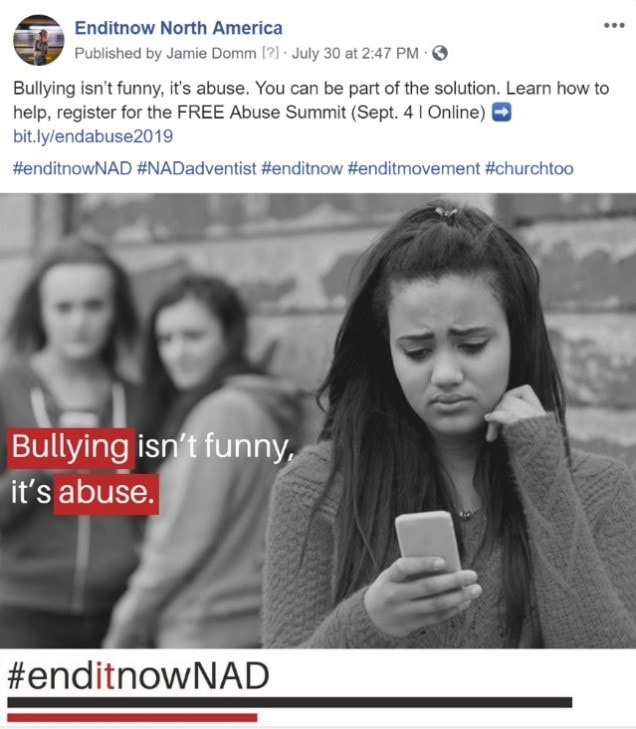
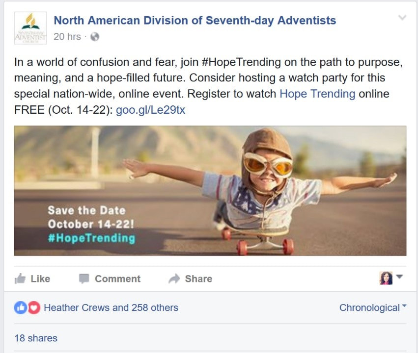
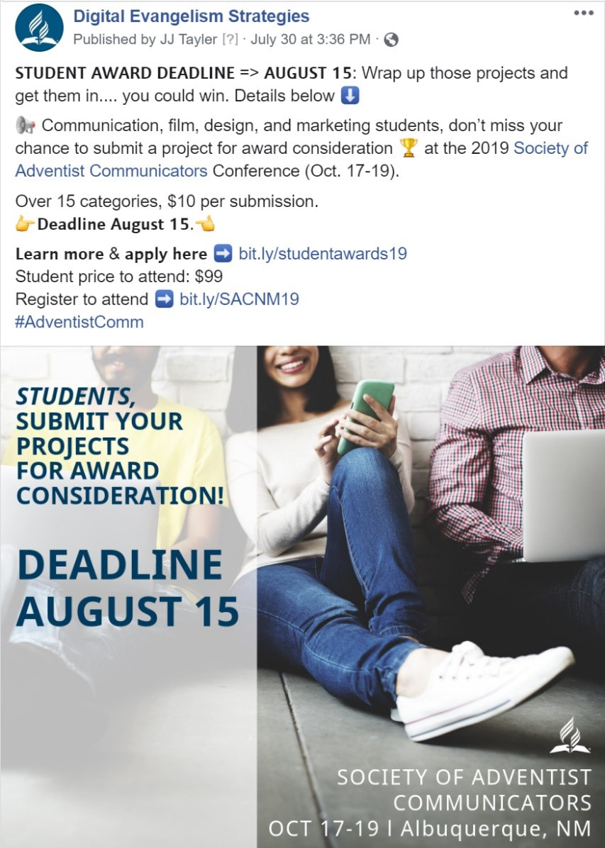
Examples:
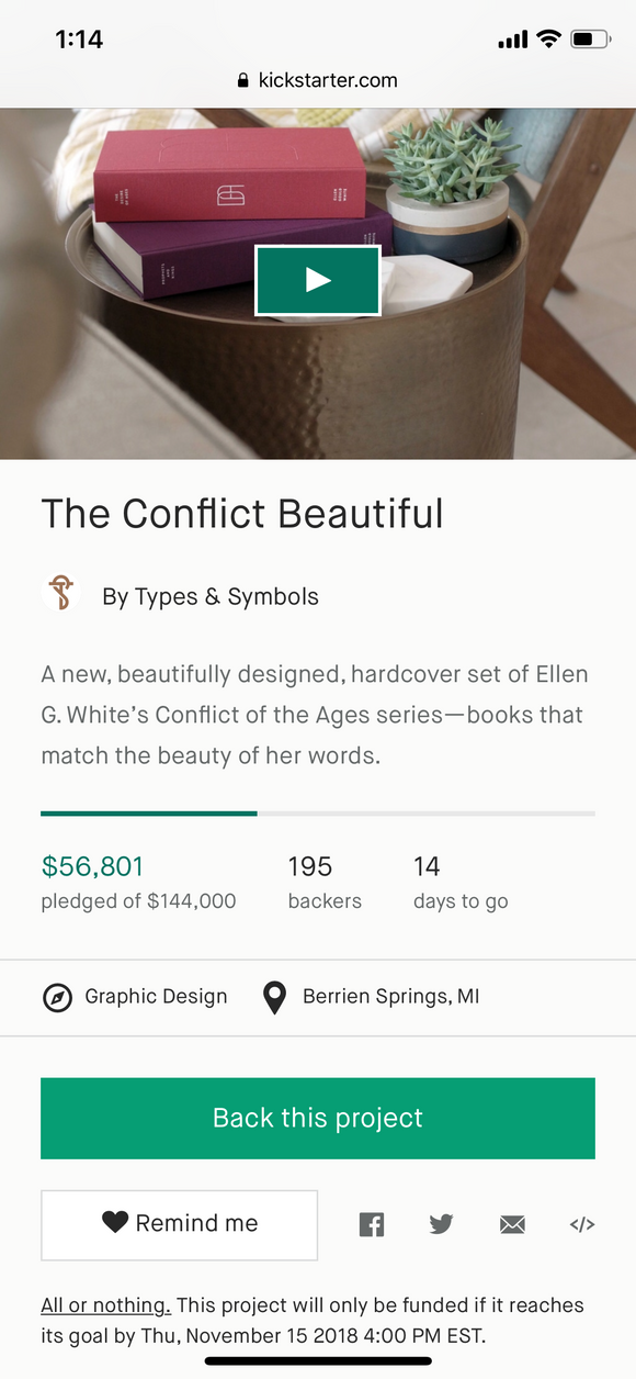
Ivan Ruiz-KnottPrincipal and designer for Types & Symbols.  A still from the promotional video for The Conflict Beautiful Kickstarter campaign The Conflict Beautiful was a crowdfunding project to create a new, heirloom-quality, NKJV edition of Ellen G. White’s Conflict of the Ages series. We reached our $144,000 funding goal on November 15, with a total of $153,330 in pledges, and since then we’ve been managing fulfillment logistics, overseeing editorial changes, refining design details, and working with the printer. It has been a tremendous joy for us to be able to work on this project, and we are humbled that so many people supported it. We’re humbled even further that, in spite of our inexperience with raising money, we were able to meet such a high goal. This was our very first crowdfunding campaign as a studio, and the first time any of us had worked to raise this much money. While we went into it with a strategy and certain amount of preparation, we learned a lot throughout the process that we’d like to share. Our strategy:Our primary strategy was to design something so beautiful and meaningful that it could sell itself. While we didn’t necessarily expect the project to go viral within Adventist circles, we did think it might be possible, and that if the project was worth doing at all, it would be because it was exciting to enough people, and not just ourselves. And by enough people, we mean about 1,000 people. The minimum print run required to get these printed at the quality we wanted was 1,000 sets, and it seemed to us that it was possible that there were at least 1,000 other Adventists who both appreciated these books and appreciated good design. If we could just find that many people willing to order a single set, we would reach our goal.  Production mock-ups of the full set in the Grayscale color palette. We should note here, for those unfamiliar with Types & Symbols, that we are a design studio dedicated to creating beautiful Adventist experiences for the church and its members. We often work with clients to help them establish brand identities, design websites, design publications, or produce promotional material for marketing campaigns. In most of those cases, we are working with established audiences, or helping fulfill a larger marketing strategy developed by an internal team. We are professional designers, not (yet) marketers, so we had very little direct experience with promoting a project of this scale. With that said, we knew we would need much more than just a beautifully designed project, so before launching the campaign, we got in touch with a number of Adventist leaders to get their input and feedback. We also knew that we needed to launch with some kind of existing base, so we also started to build a mailing list in the months and weeks before launch, through purchasing print and digital ads, and exhibiting at events. In meeting with people, both leaders and lay-people, we heard a tremendous amount of enthusiasm, and it buoyed our hopes that this project might come to life. 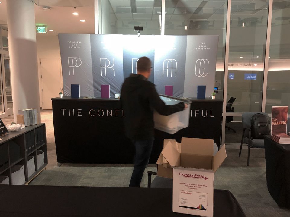 Mark setting up the booth at the 2018 Society of Adventist Communicators Convention. Finally, once the campaign was live, we knew that we would need to continue building awareness, so we also prepared various design and video materials so that we could maintain a steady stream of promotional posts throughout the campaign. The Conflict Beautiful from Types & Symbols on Vimeo. And then we launched the project. What happened:
Except for the concern around money, we realized that we could have, and still had the opportunity, to provide greater clarity about why this edition was unique, how it wouldn’t exist without pledges made in advance, and how to go through the process of pledging itself. In response to the slowing growth, and some of the reasons we were hearing, we got more more advice and began tweaking our approach. We adjusted our promotional messaging, updated the campaign page for clarity, and added in a few higher level pledge options. And we prayed, a lot. As it turned out, we ended up receiving a significant amount of our pledges from the higher-level pledge amounts, contributed by a small group of very generous individuals. That, paired with an increase in single-set pledges during the final few days, allowed us to reach our goal, and what a relief and encouragement that was! 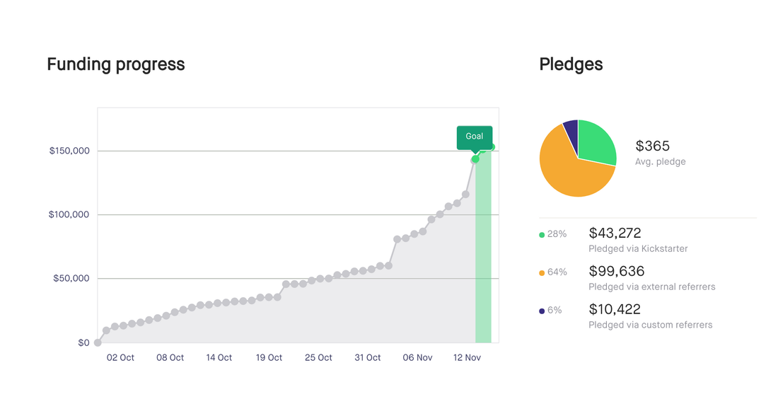 What we learned:1. Crowdfunding is not commonly understood We knew that not everyone would be familiar with Kickstarter, but we had assumed there would be enough familiarity with the concept of crowdfunding. Because of this, we didn’t make a point of clearly explaining how it worked—preferring instead to make posts the focused on the value of the project. After speaking with people, we realized that we certainly should have provided more education about how Kickstarter worked. We spoke with a lot of people who had heard about the project, or seen the video, and quite a few of them said things to the effect of “I’d love to get a set once they’re available!” We would then explain that they might never be available unless people preorder. A lot of our early ads, both print and digital, had been subtle and minimal, with aspirational messaging like “coming soon”, and at the end our messaging started to approach more desperate and overt, like “coming never!—unless you go to Kickstarter and make a pledge/pre-order right now!!!”
2. There is no silver bullet Another thing we learned, or, better stated, was reinforced for us, is that reaching a broad swath of Adventists is very difficult to do. While a number of publications have a wide reach, there are so many things competing for people’s attention, even within the Adventist Church, that it is really easy for people to ignore all of them. We ran print ads, social media ads, exhibited at events, were interviewed for different publications, had other organizations share the project on their own feeds, and in total these were all the different entities that included some mention of the project:
We completed the campaign with 419 backers, with many backers choosing to back more than one set. The total number of sets purchased through Kickstarter was 880. Ultimately though, a significant percentage of our funding was the result of personal connections, and the personal connections of those personal connections. This doesn’t necessarily suggest to us that we should invest less in advertising with the above entities for future projects (multiple exposures are always valuable), but perhaps that we should invest more in developing and cultivating these smaller, more passionate audiences. 3. Building an Audience is key Related to the above, we realized that could have done a better job at building an audience ahead of time. As a studio, we’re not actually very active on social media, and we don’t currently produce much content, so when it came time to reach out to our existing audience of followers, we didn’t really have an audience. In creating this project, we’ve certainly built one. Our mailing list gained nearly 800 subscribers which we’ll be able to reach out to in the future (and helps get us close to 1,000 true fans). We’re also thinking about ways to provide more ongoing value so that, when it comes time to launch another project, there is even more familiarity with our studio, the quality of work that we do, and what we value. 4. Timing matters We realized partway through the campaign that we could have benefitted from launching at a less fraught time. This is more of a suspicion than anything we can measure, but we launched our project around the same time that a lot of concern was starting to be felt in North America (our target market) around conversations at GC Annual Council as well as NAD YEM. The news cycle during this time moved a bit more quickly than it tends to at other times during the year, and we realized that write-ups and links about our project were getting buried pretty quickly. For a marketing campaign that relies on more traditional forms of media, paying attention to the news cycle is important. What we will do differently on the next project:Something we learned from our discussions with people who have engaged in fundraising before is that it is valuable to build in commitments before launching, so that we launch with a certain amount already promised, or ‘in the bucket’. It’s possible that having such a large goal as we did caused some individuals to think that it wasn’t worth pledging because it seemed like such an impossible goal for them to make a difference to. On that note, we arrived at the figure of $144,000 because it was close to what we needed to cover the cost of production, and it seemed like a fun detail, even though it involved rounding down a bit. A lot of people who saw the project also thought it was fun, but we also heard a lot of questions like “but how much do you actually need?”, so in the future we’ll pick less clever numbers, and try to be more explicit about why we need whatever amount we need. Another thing we would do differently for future projects is adjusting how we handle the crowdfunding. Some of the major benefits of Kickstarter (discoverability) don’t matter as much for the nature of the products that we create, or for the audience that we create them for. Furthermore, we discovered after committing to Kickstarter that their options for calculating and handling international shipping were very limited, which in effect reduced the reach of our project. Finally, there were a small number of individuals who’s advice and support had a disproportionate impact on the success of the project, and for our next project we will get them involved much, much sooner. What’s next for Types & Symbols?We have a lot of ideas for future projects, but for the meantime we’re staying focused on finishing up work on The Conflict Beautiful and serving our existing clients. If you didn’t have a chance to back the project, we’re still accepting preorders for the full set at theconflictbeautiful.com.
Heidi Baumgartner, M.S.Communications Director for the Washington Conference.  The point of bulletins is to be inviting to visitors and to be engaging for members. Bulletins should be more than just a formality; they should be invaluable tools used each and every week. — Sean Amster, media ministries blogger Evaluate your goals. How do you want to use your bulletin? How are you actually using your bulletin? How can you make it better? Templates are your friend! Set up simple template structure. Select an attractive cover matched to the sermon series, season, or mission. Selectively use graphics, images, icons and clip-art. Limit yourself to 2-3 fonts and colors. Give visual structure. Give weight to what is most important and make your bulletin easily scannable. Breathing room (called white space) is helpful. Share worthwhile content. After entering your order of service, include options like: Upcoming church events (with point of contact), ministry spotlight, ways to get involved, Bible study/small group options, sermon outline, notes area, a list of ministries, testimonies, prayer requests, a short welcome statement, a scripture verse, church contact information. Any items that will help visitors and members alike to connect and reconnect. Proofread! Misspelled words negate your credibility. Should you use bulletin inserts? Some experts say yes! It gives a “third dimension” of engagement. Your bulletin is a key way in which you communicate to your congregation, so it should be well thought-out. Heidi Baumgartner, M.S.Communications Director for the Washington Conference.  How can your mission best be illustrated on your websites? Consider your:
WEBSITE QUALITIESAppearance: Keep your page looking clean by choosing coordinating colors, an easy-to-read web font, and illustrative graphics. Aim for a simplistic look that shows an organized and logical layout. Content: Write in a friendly-tone to help your audience feel valued and informed. Group related items, be concise in your verbiage to avoid blocks of text, and break your content up by using headers to help skimmers slow down and read. Functionality: Keep the essentials easy to find for your audience: contact, events, social media, service times, etc. Review content over to ensure an error-free webpage. Usability: Beyond appearance, navigation is the second feature your audience uses to explore your webpage. Give your navigation a logical sitemap to avoid confusion and frustration. Findability: Use 3-5 keywords per page to increase your Search Engine Optimization and chance of being found. Provide accurate contact information to promote better connections. Adaptability: Websites have a 1-2 year lifespan and user aspects are constantly changing. Repackage your content and adapt it to keep up with your audience needs. RELATED ARTICLES:Heidi Baumgartner, M.S.Communications Director for the Washington Conference.  Great (and not-so-great) design is all around you. Cultivate an increased visual awareness. Find a design you like, and recreate it into your needs. Mimic a magazine spread, book display, event flyer, or another attractive design. Watch tutorials from Before & After’s John McWade, Lynda.com, or read Robin William’s Non-Designer’s Design Guide. STARTING A NEW PROJECT
If everything on the page is big and bold and flashy, then there is no contrast. Be big and bolder, or small and lighter. The point is that it is different. VISUAL IDENTITYA design structure gives you freedom to create within guidelines.
The Adventist Church recently released a dynamic visual identity guide with a suggested color palette, Creation Design Structure, fonts, updated logo, and a variety of templates. Explore the Adventist Identity Guidelines>> Jacklyn RuthDigital Strategies Intern for the North American Division  So, you use Instagram on a regular basis. You tag your #OOTD and share with tons of people, what you are eating daily. And since Snapchat doesn’t seem to mind being copied, you can post all your funny dog faces and flower crowns on an Instagram story. But have you ever thought about being mindful with your Instagram feed? Have you taken the time to decide on a theme? Did you know that you can style your Instagram grid to look appealing to your followers and stand out as unique? First off… What will your theme be? In other words, what are you passionate about? Personally, I have two IG accounts, one is dedicated to my book blog, and the other is my personal account. I have to decide: do I post about events I attend on my private IG? Places I’ve been? Decide on your niche and you are half-way there. Style You’ve decided what you want to post…now how do you post it? Consistency is key.
More Advanced Style If you want to get more advanced, there are a few techniques you can implement onto your feed.
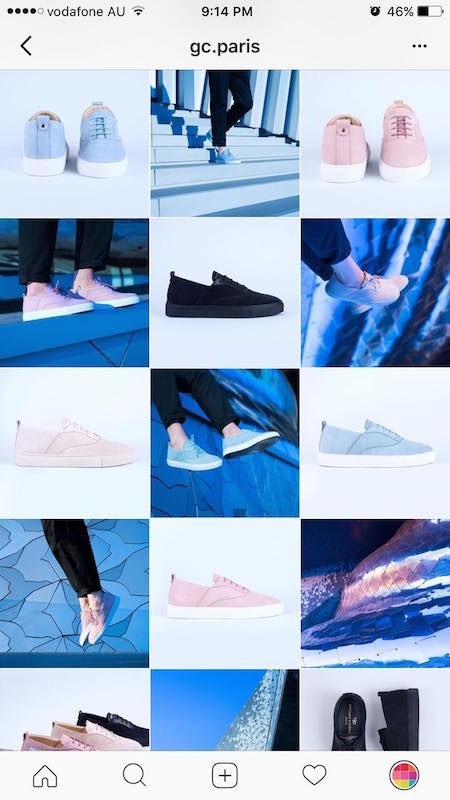
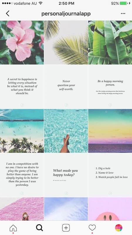
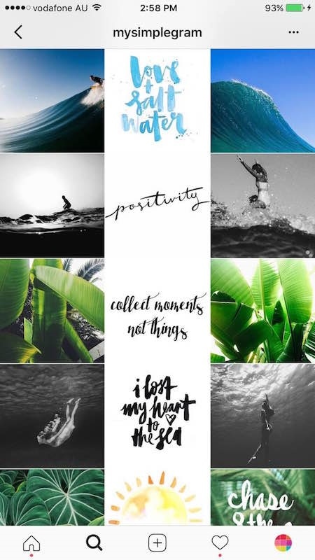
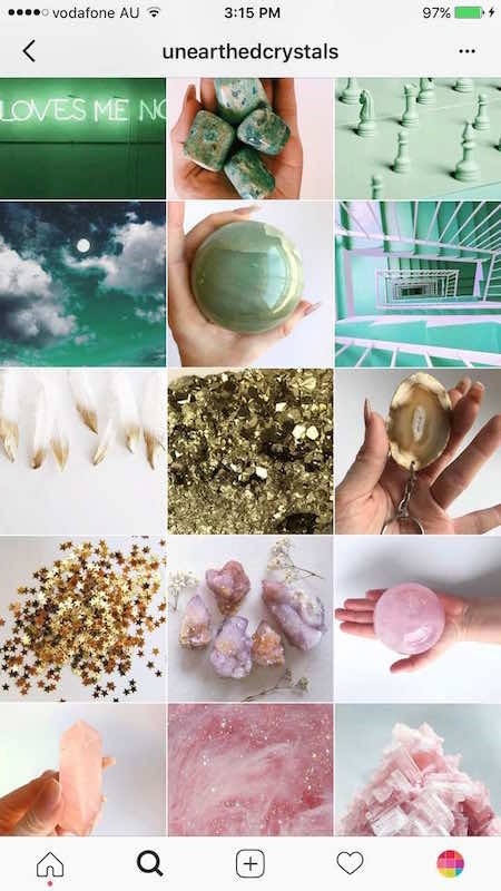
 These are just a few ideas you can use to make your Instagram feed stand out. Borrow these ideas or modify them to your liking. The feed is your canvas.
Have a creative idea for a unique Instagram look? Share it with us using #DigitalEvangelism. Jacklyn RuthDigital Strategies Intern for the North American Division  Projects take time to create. Finding the images to support them should not add to the stress. Luckily, there are lots of places online where you can find free stock images for your blog, company, project, social media platform or website. Guidelines for Choosing Good Photos
 There are several free (or low cost) image editing and design programs.
Canva - Free and low cost images Stock photos provided by Canva.com, a web-based design software ideal for social media and other digital formats. A great resource for design tools, templates, editing, design tutorials and more. Burst (by Shopify) - Free Burst is a resource from Shopify that provides free stock photos for entrepreneurs. It has photos of niche interests, everything from DIY beard oil to Aliexpress LED sneakers, but you can also find more general photographs. Death to Stock Photos – Free, but pay for premium access Every month a photo pack of 10 photos within a certain category will be delivered to your inbox. The goal of Death to Stock Photos is to bring you a variety of options to use for your mockups, blog posts, or social media posts. Death to Stock Photos uses their own license which you can read on their webpage. Epicantus - Free Epicantus contains free original photography by Daria. You can use these hi-res photos for your landing pages, blog posts, and designs. All photos are released under creative commons CC0. FoodiesFeed – Free, but pay for premium access FoodiesFeed offers thousands of beautiful and realistic food pictures in high resolution. It’s the perfect stock photo site for food bloggers. Freestocks.org - Free Freestocks has a wide range of pictures, from animals to kids to food and people. All images are released under Creative Commons CC0. Gratisography - Free Gratisography offers free high-resolution pictures you can use on your personal and commercial projects. New pictures are added weekly and are free of copyright restrictions. Life of Pix - Free Life of Pix is a resource created by the LEEROY creative agency, offering free high-resolution photos with no copyright restrictions. New pictures are added weekly. Little Visuals – Free subscription; donation optional All photos posted on Little Visuals were released under the creative commons license public domain dedication. They have lots of nature and landscape photos. MMT STock - Free MMT Stock is a collection of high-resolution photos provided by Jeffrey Betts. Jeffrey likes to share photos of computers and workspaces as well as flowers and nature. All photos are released under Creative Commons CC0. Negative Space – Free email subscription and free download Negative Space provides 20 new photos every week released under Creative Commons CC0. The pictures are searchable and can be sorted by category, copy space, and color. New Old Stock - Free These pictures all have a vintage vibe and are separated into categories. They are mostly black and white pictures of people and places. Pexels - Free Pexels has lots of free images to use and a wide range of categories, from people to things. It’s very easy to download. Picography – Free, $15/month for premium Picography contains beautiful free stock photos submitted by Dave Meier and various other photographers. All photos are released under Creative Commons CC0. Pikwizard - Free This site offers over 100,000 completely free images. Pixabay - Free Pixabay offers a large collection of free stock photos, vectors, and art illustrations. All photos are released under Creative Commons CC0. StockSnap.io - Free StockSnap.io has a large selection of beautiful free stock photos and high-resolution images. The site also tracks views and downloads so you can find the most popular photos available. Unsplash - Free Unsplash has lots of high resolution photos and updates them often. They have lots of landscapes and people. Wiki Commons - Free Wiki Commons has free images and highlights the image of the day. The site sponsors a photography submission challenge and offers a wide range of photos. Be sure to read the permissions on the photos you choose before using them. When cropping and editing your pictures: Use the rule of thirds. The rule of thirds, however, is a guideline, not an absolute. Important elements of the picture should be near the intersecting lines and horizons should match up with one of the horizontal lines. This technique creates tension, energy, and increases interest. Apps for editing images on the fly:
Overlaying Text 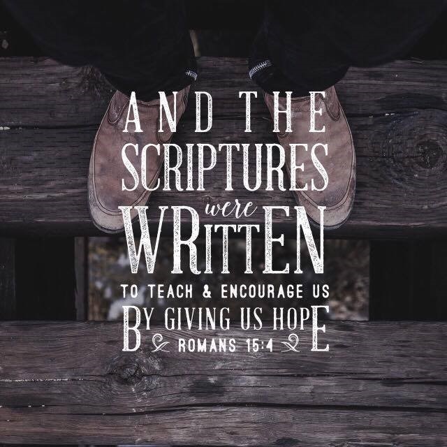 If you want to achieve a similar look to your images as the sample above, there are ways to do it without being a professional designer. There are several apps that will help you place your copy onto your picture.
Click here to learn about copyright and trademark basics. Leave your comments below and share your creations with us using #DigitalEvangelism. |
Archives
August 2020
Categories
All
|
||||||||
- Home
- BLOG
-
RESOURCES
-
RESOURCE MENU
>
- ADVENTIST IDENTITY GUIDELINES
- BIG DATA RESOURCES
- BRANDING, IMAGE & DESIGN RESOURCES
- CHURCH/MINISTRY SPECIFIC RESOURCES
- COPYRIGHT & TRADEMARK BASICS
- COURSES
- EMAIL RESOURCES
- GUIDANCE FOR HIRING SOCIAL MEDIA POSITIONS
- PODCASTS
- REPORTS & CASE STUDIES
- SOCIAL MEDIA RESOURCES
- (SOCIAL) VIDEO RESOURCES >
- TEXTING 4 CHURCHES
- TRACKING & ANALTYICS
- WATCH VIDEOS & TUTORIALS
- WEBSITE TIPS
- SOCIAL MEDIA GUIDELINES
-
RESOURCE MENU
>
- SEO
- Digital Discipleship & Evangelism
- COVID-19 RESOURCES
- eNEWSLETTER


 RSS Feed