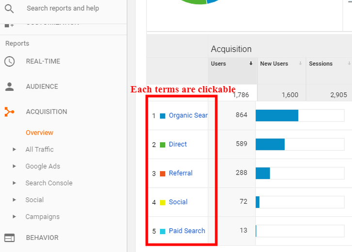
Amy PrindleThe Center for Online Evangelism is a missionary project devoted to developing online mission stations. Helping you get the most out of viewing and interpreting this valuable data to most effectively optimize your website.When you log in to Google Analytics or Search Console with no prior knowledge of these tools, it can seem overwhelming! But soon you’ll discover just how much you can learn from this data, and how useful it can be in planning technical or content updates. It will become second nature with continued use. In this section, you’ll learn how to quickly check for site errors that may affect search engine performance or user experience, and you’ll learn to interpret how effectively users are navigating your site. You’ll find out if any important pages are being missed, or if certain pages are causing a drop-off in traffic. By tracking your audience’s patterns, you can better plan your content to match their preferences and behavior, which can dramatically improve engagement. We’ll start with terms and basic functions, followed by a screenshot-assisted walk-through of each tool. You will see these terms in the menus and reports of Google Analytics or in Search Console displays, so you’ll likely understand them even better when you see them in context. A technical vocabulary list can seem intimidating at first, but as you get to know and interact with the platform it will quickly start to make sense. (NOTE: Not all terms will be covered in these tutorials—only the most immediately necessary). Google Analytics Terms and Functions Terms change so if you run across a term in Google Analytics that you are unfamiliar with, hover over it and a brief description pops up. Average Session Duration: The average amount of time a visitor stayed on your website. Two to three minutes is favorable, while less than one minute implies that visitors didn’t find what they were looking for. Behavior: This element measures how users interact with your site, or with applications on the website. Standard metrics include the number of users interacting with your application, the number of sessions those users create, and the screens or web pages they visit. Bounce Rate: The percentage of users that come to the website and then click out immediately, signifying that they did not find what they were looking for. The lower the number, the better. When the number is higher, this tells Google the page isn’t relevant to the search terms being used to find it. NOTE: Don’t take this number too seriously—Google often considers it a “bounce” whenever someone hits the “back” button, which doesn’t always mean that the person didn’t find what they needed in the page content! It may be that they found what they needed on that one page and left. Conversion: Completion of an activity that is important to the success of your business, such as a completed sign up for your email newsletter (a Goal conversion) or a purchase (a Transaction, sometimes called an Ecommerce conversion). Direct Visitors: Direct visitors have come to your site by typing in your organization’s exact URL into the address bar in the their browser. Key Performance Indicators (KPIs): Measurable values that demonstrate how effectively your website is achieving its objectives, such as number of sessions, target bounce rate, number of returning visitors, demographics engagement, etc. New User: A first-time visitor to the website (unique IP address) Page/Session: This shows how much a visitor engaged on the website, such as how many pages they clicked on. Referral Visitors: Visitors who visit the website because it was mentioned somewhere on another website or blog that they were visiting. Sessions: A “set” of a user’s interactions within your website that take place within a given time frame (set to a default of 30 minutes). This can mean multiple page views, social commenting, or ecommerce transactions (for more information, try this Google support article). Users: People who have started at least one session during the date range. Navigating Your Google Analytics Dashboard NOTE: If you just set up Google Analytics, we recommend letting it gather a month’s worth of data before making in-depth analyses. Otherwise you will not have enough data to truly determine usage patterns. Usage patterns fluctuate throughout the year and around holidays. Over time, you’ll become familiar with the regular patterns of visitors. After logging in, you’ll immediately be taken to your Home area which provides a snapshot of (by default) the last seven days of activity on your website. By selecting “28 days” in the drop-down menu on the bottom left of that box, you’ll get a more complete picture of average use patterns. Other boxes on the Home screen show user trends, regions users are browsing from, and which devices are used for browsing (desktop, mobile, tablet). It can also be helpful to scroll to the last box that displays which pages your users visit, with the most popular on top. 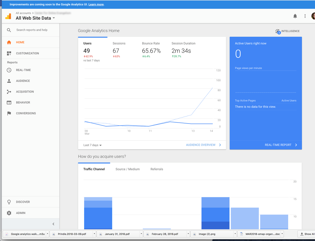 Got specific questions already? A great place to start your Google Analytics journey is at the top left of the page, the Intelligence section. This will guide you through Google Analytics by asking questions like “Where is my traffic coming from?” or “What were my most popular pages from July 1-24?” This will also notify you of any inconsistencies in your data. These anomalies (the term Google uses) will be presented as insights. Insights will explain opportunities, trends, or changes that can have an impact on your website. For example, it can show you that a certain landing page is getting more traffic than before or if the number of new users is dropping. The information presented here allows you to adjust accordingly. 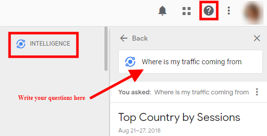 You can find your insights on your Home page in the second row on the right. 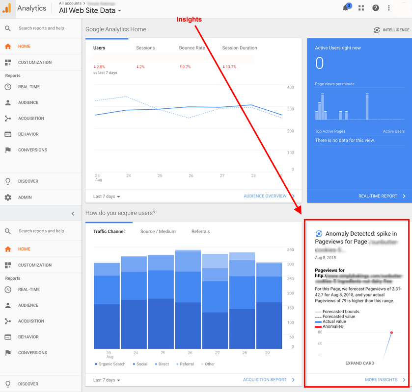 Helpful Reports With several reports to choose from, the most immediately helpful reports can be: AUDIENCE—Overview (Who’s visiting?) Above the line graph to the right, select “Month” to get a clearer average. This will give you a more in-depth look at how many users are coming to your site and how they spend their time. 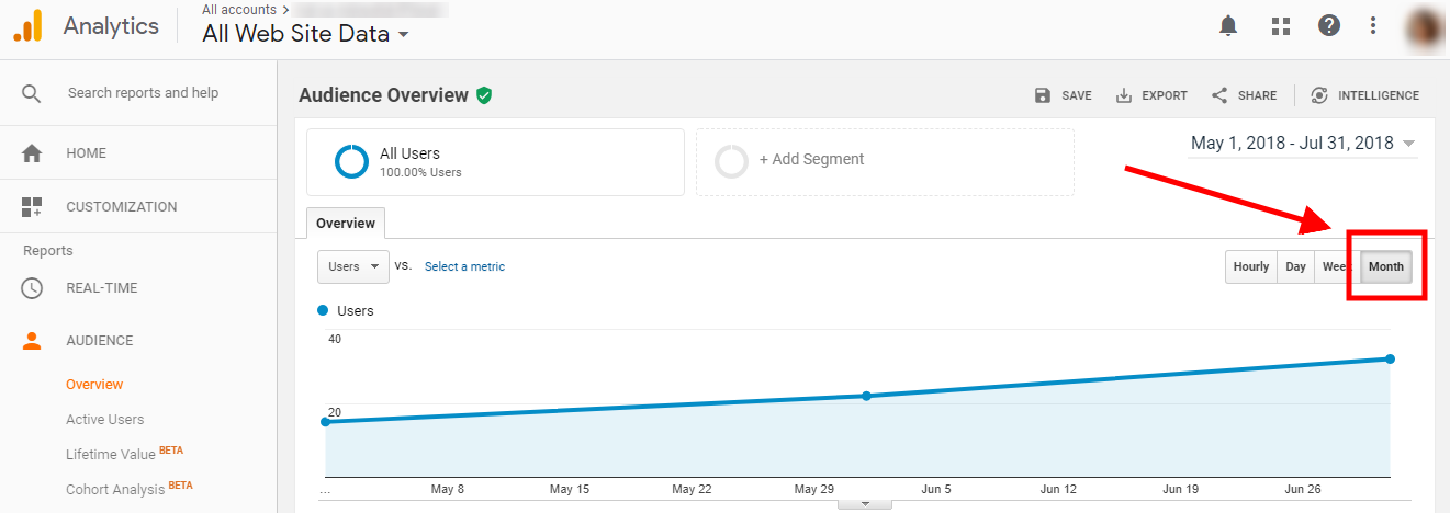 AUDIENCE—Geo Under Geo you can view the Language used by the viewer. If you see significant percentages in different languages, it could be a tip that a translated page could be helpful to your audience. 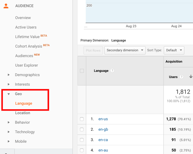 If you are a local organization that depends upon local traffic to your website, click Geo > Location > City to see if your target area is engaging with your site. 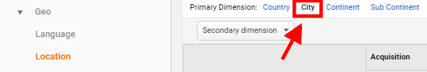 AUDIENCE—Demographics—Overview If your content is targeted to a certain age or gender, you’ll want to look here. You can view the age and gender (see arrow 2) of the users who visited in the last selected timeframe. At the top right you can customize the timeframe by date (arrow 3). 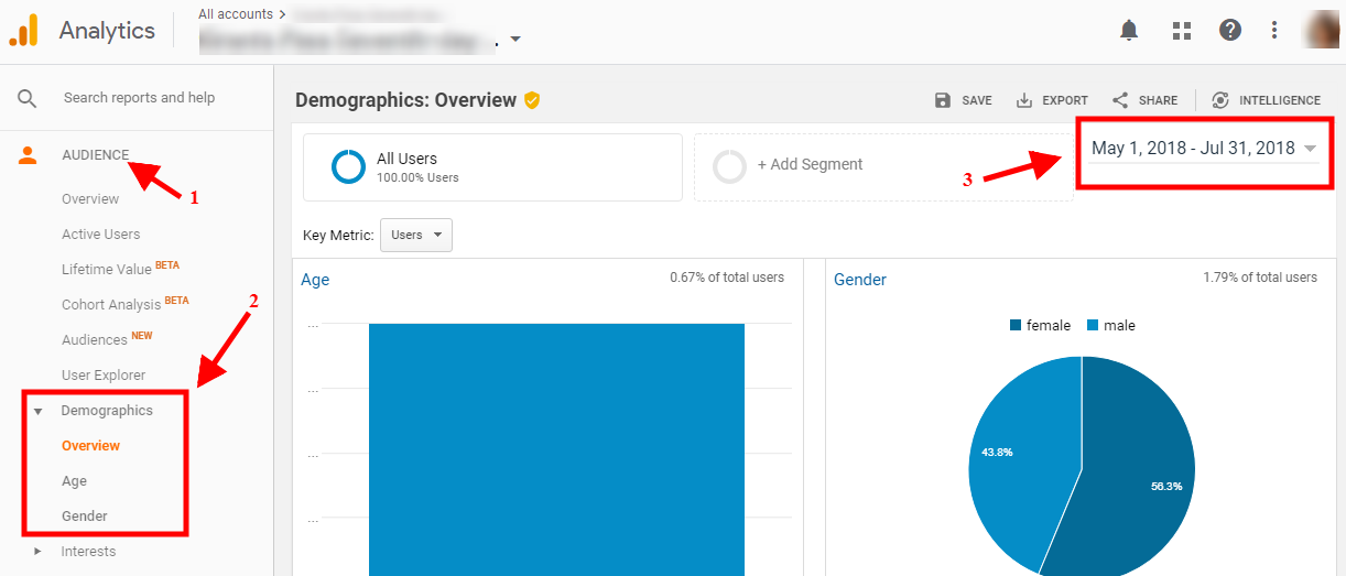 ACQUISITION—Overview (How are they getting here?) With the default timeframe set to 3 months (found in the right corner of the page), view how people are getting to your site: 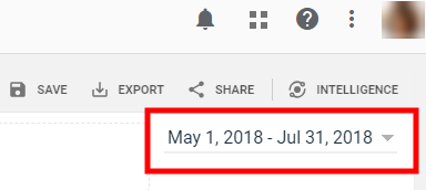 These visitors may have clicked to your site via:
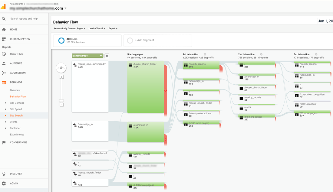
 ACQUISITION—Social—Overview Scroll down in the Overview window to Social Value. Unless you’ve worked ahead, you won’t have any goals here. However, you will be able to see how many sessions have come from which social media platform. Study this data and compare it to how many posts you’ve published in the selected timeframe (3-month default). 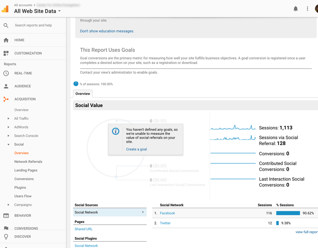 ACQUISITION—Social—Network Referrals This is big for social media managers! This report lets you see which pages users are coming in on through social media referrals. This can help you track which posts are driving users to your site, depending on which URL was linked in the post. 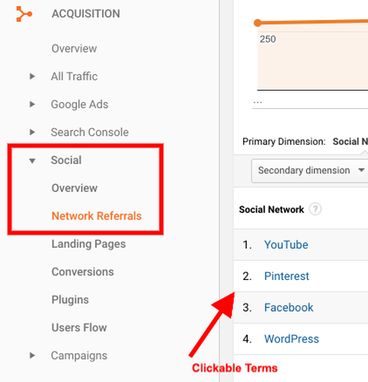 ACQUISITION—Social—Users Flow This journey map starts with the social media platform that brought the user to your website. See which page URL they clicked on, which can indicate which posts are getting the most activity and which events are encouraging click-throughs. If you hover over the Starting Pages or Interactions, you’ll see a pie chart representation of how many users kept navigating your site, and how many dropped off at this point. Use this data to review your site content, and determine if users are finding what they need or getting frustrated/bored and leaving. 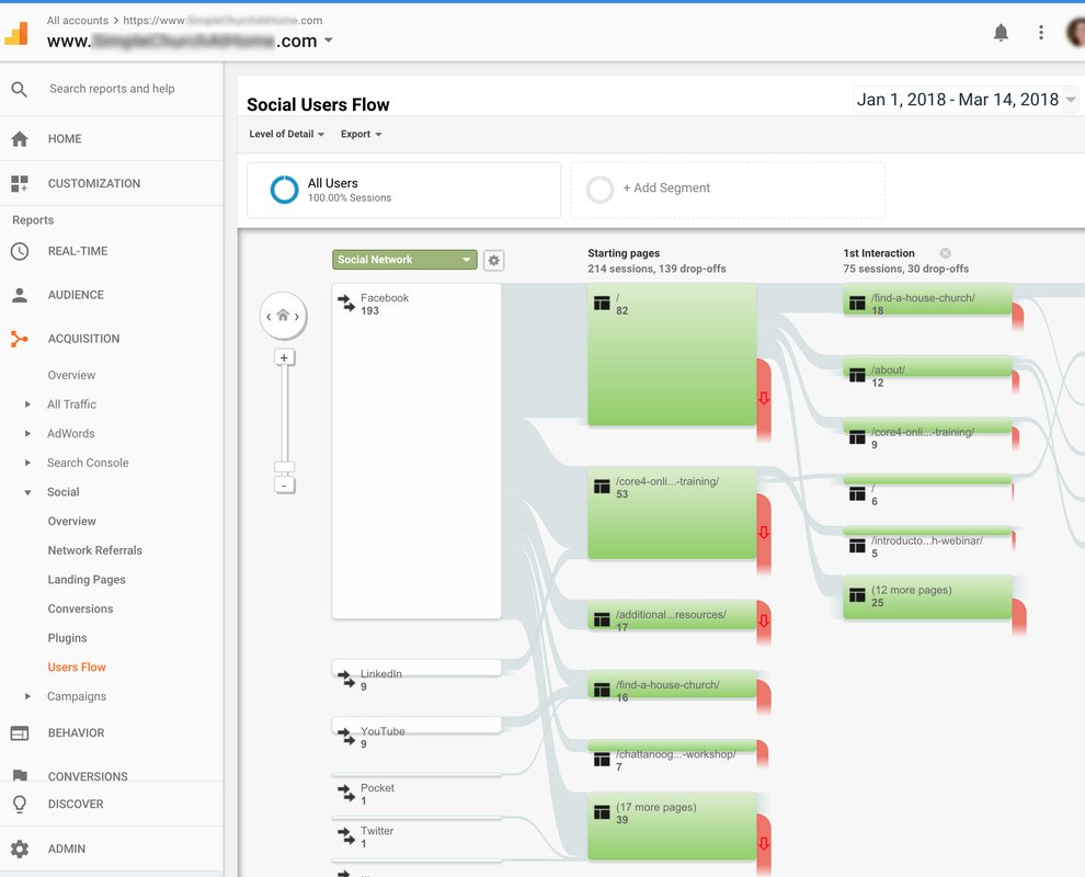 BEHAVIOR—Overview (What are they doing?) The Behavior Overview provides a graph showing the amount of traffic your website receives and how they use your site. Make sure to select “Month” above the line graph. These are the most important metrics here: 1) Pageviews, 2) Unique Pageviews, and 3) Average Time on Page. 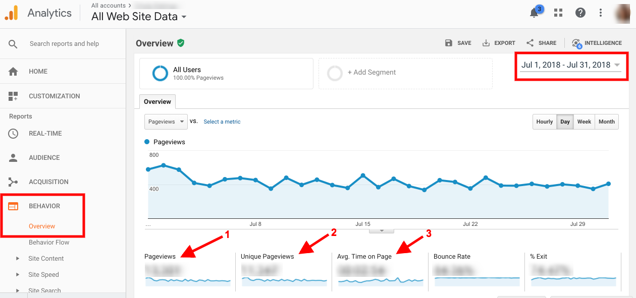 The Site Content section describes how visitors engage with pages on your website. For example, under ALL PAGES you can see your top pages and how many views they receive, average time on page, plus which type of page is most popular—helping you determine what content performs best on your website (remember the best way to determine this is to select it by month on the upper right on the screen).  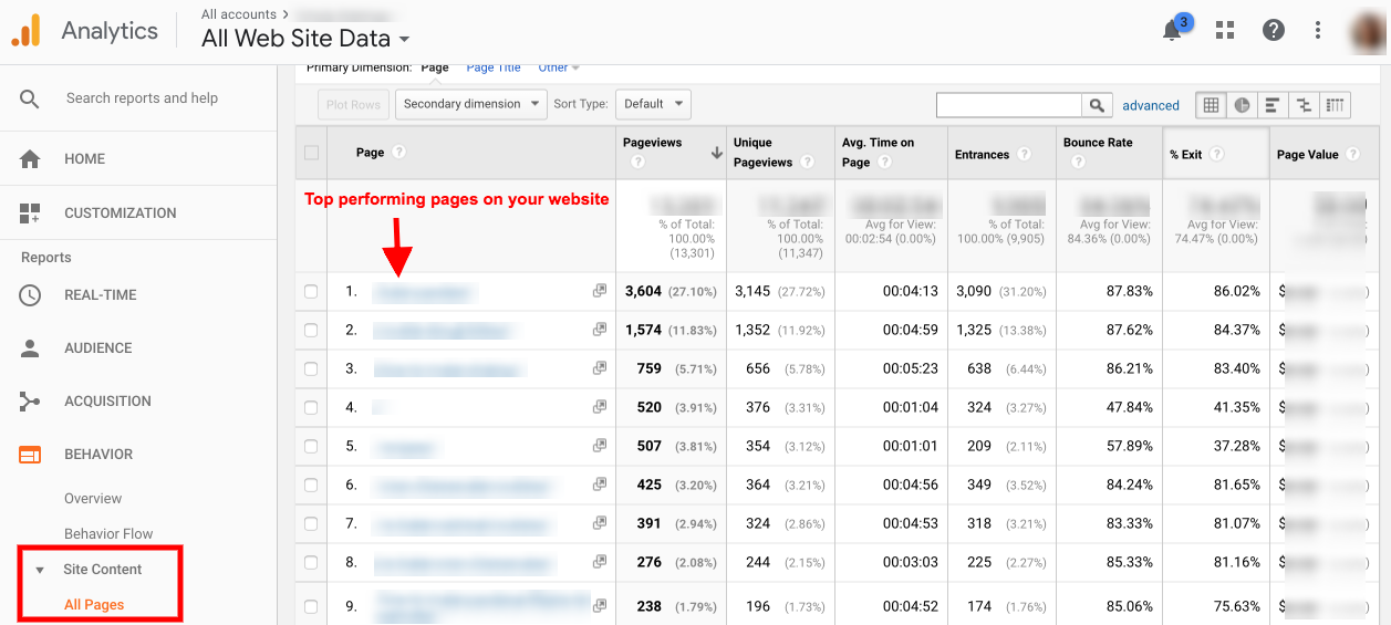 If you find that your most popular pages are different from the ones you’d like more people to view or spend time on, you might need to adjust your content or how your sitemap is organized.  BEHAVIOR—Behavior Flow (Where are they going?) Another visual journey map shows you which pages users encounter first when they visit your website (listed as the Landing Page). It may be the Home page or it may be an article, contact page, or a bookmarked link that has a map or login function. You can drag the map to the side, viewing the first, second, and third interactions, to see where users clicked to after coming to the site. You can use visual data like this to see if users are taking the path you intend for them. If not, or if they’re dropping off before they get to a page where you want them to take an action, such as read an article, download a PDF, or make a purchase, it may mean:
 BEHAVIOR—Site Speed—Overview Select “Month” at the top right over the graph. Remember, you’re shooting for a page load time of under two seconds. Your average page load time averages data from all your pages. 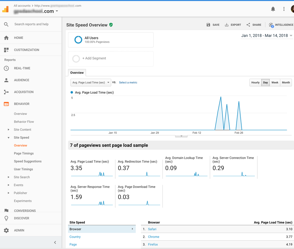 BEHAVIOR—Site Speed—Page Timings This shows the average load time of each individual page, so you can better pinpoint what pages may be slow and affecting the average site load time. (You can also run the Screaming Frog SEO Spider tool to determine what elements are affecting page load time, or check Google’s Page Speed Insights tool). These Google Analytics overview reports will be most helpful for you as you begin consistent use of this tool.
Getting a big-picture view of how your current audience is interacting with your site can help you identify any “roadblocks” that might be inhibiting users from completing a desired action. It will also help you plan your future content by revealing which content is inspiring further browsing throughout your site. If you’re interested in a full course on the effective use of Google Analytics, check out Google Analytics Academy, Google’s free resource for Analytics users. Additional Resources:
Comments are closed.
|
Archives
August 2020
Categories
All
|
- Home
- BLOG
-
RESOURCES
-
RESOURCE MENU
>
- ADVENTIST IDENTITY GUIDELINES
- BIG DATA RESOURCES
- BRANDING, IMAGE & DESIGN RESOURCES
- CHURCH/MINISTRY SPECIFIC RESOURCES
- COPYRIGHT & TRADEMARK BASICS
- COURSES
- EMAIL RESOURCES
- GUIDANCE FOR HIRING SOCIAL MEDIA POSITIONS
- PODCASTS
- REPORTS & CASE STUDIES
- SOCIAL MEDIA RESOURCES
- (SOCIAL) VIDEO RESOURCES >
- TEXTING 4 CHURCHES
- TRACKING & ANALTYICS
- WATCH VIDEOS & TUTORIALS
- WEBSITE TIPS
- SOCIAL MEDIA GUIDELINES
-
RESOURCE MENU
>
- SEO
- Digital Discipleship & Evangelism
- COVID-19 RESOURCES
- eNEWSLETTER
 RSS Feed